Model 01
Design + Build
Brief to handover — design, engineering services, construction and project management under a single contract.
Best for — one party accountable end to end

Architecture · Interior Design · Project ManagementOne firm that draws your spaces & then builds them.
Design intent gets value-engineered away by a contractor who never sat in the concept meeting. The client ends up arbitrating between two parties who each blame the other — and the programme slips in the handover between them.
Alygn was built to remove that gap. We design, and we build what we design.
Design, engineering services, build and project management.
Growing to 15 by mid-2027. Plus our own trade network — and a partner on every project, first meeting to final snag.
Commercial · Institutional · Hospitality · Residential · Healthcare
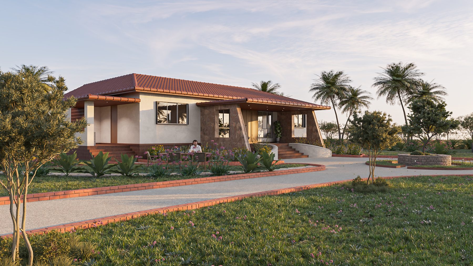
We are equally comfortable authoring the design or delivering someone else’s.
Brief to handover — design, engineering services, construction and project management under a single contract.
You hold the design. We build it — to your drawings and intent, with our own site team and your authority preserved.
Concept through to GFC drawings, specification and BOQ, handed to a contractor of your choosing.
We run programme, procurement, vendors and quality on your behalf, without holding the build contract.
We always believed in executing our own projects, because it lets us define the details on our terms.
Tell us about the site. A partner replies — there is no account layer between you and the people doing the work.
Every project here was drawn and built by the same team. Photographs are marked as photographs; projects still in delivery are shown as design visualisations — and labelled so.
Detailed case studies — drawings, specifications and site records — are available on request.
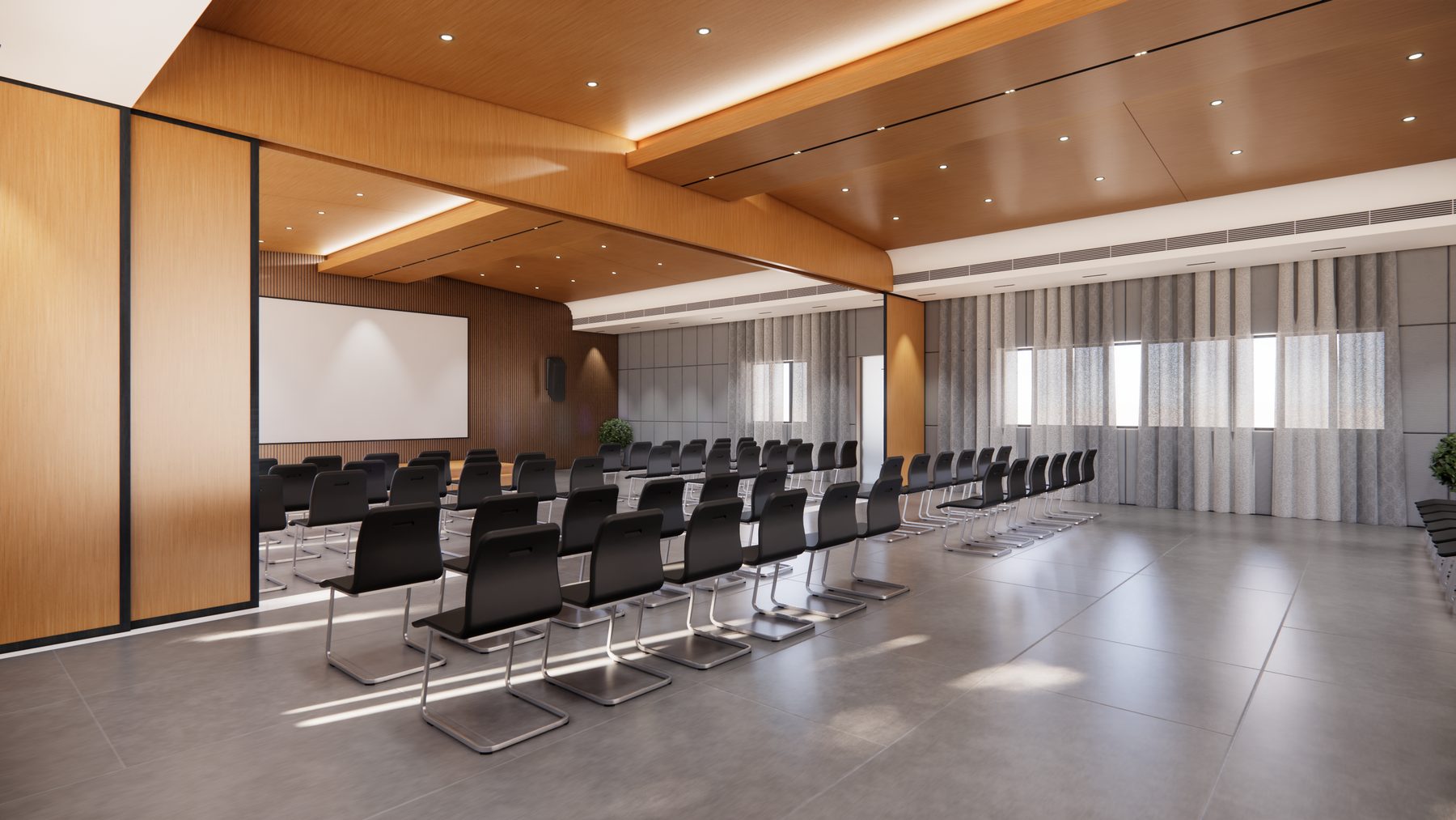
A community hall for a design college. Each department gets a studio of its own — and when the whole college needs to meet, for a lecture or an institutional event, the five studios become one room.
Making one room into five is the easy part. The real brief was five rooms that work at the same time: partitions that any staff member can set up in minutes, and acoustics good enough that a lecture in one studio never becomes the soundtrack of the next.
A single 43.7 m volume that subdivides into five acoustically separated studios along four lines of top-hung operable partitions, concealed within the ceiling line. Fully open it seats the whole college; fully closed it gives five departments a studio each — reconfigured by campus staff in minutes, without tools.
The partition had to be easy enough to use every day, by anyone on the campus team. So it hangs from above: each panel rolls on trolleys along an aluminium track hidden in the ceiling, with no floor channel to trip on or to clog. Panels park in a compact stack at the side, draw out one by one, and lock to each other on concealed magnetic seals.
Concealed within the ceiling line.
Panels roll from above — nothing runs on the floor.
Each panel fine-tuned for true alignment.
Light to move, rigid in daily use.
High-density infill for sound insulation.
Close the joint between panel and panel.
The studios will often run together — a critique in one, a lecture in the next, a workshop beside it. A partition only stops sound if everything around it is planned too, so acoustics was worked out room by room, not panel by panel.
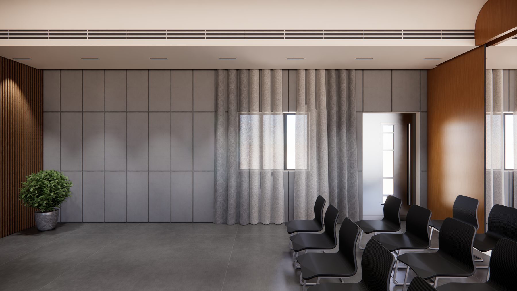
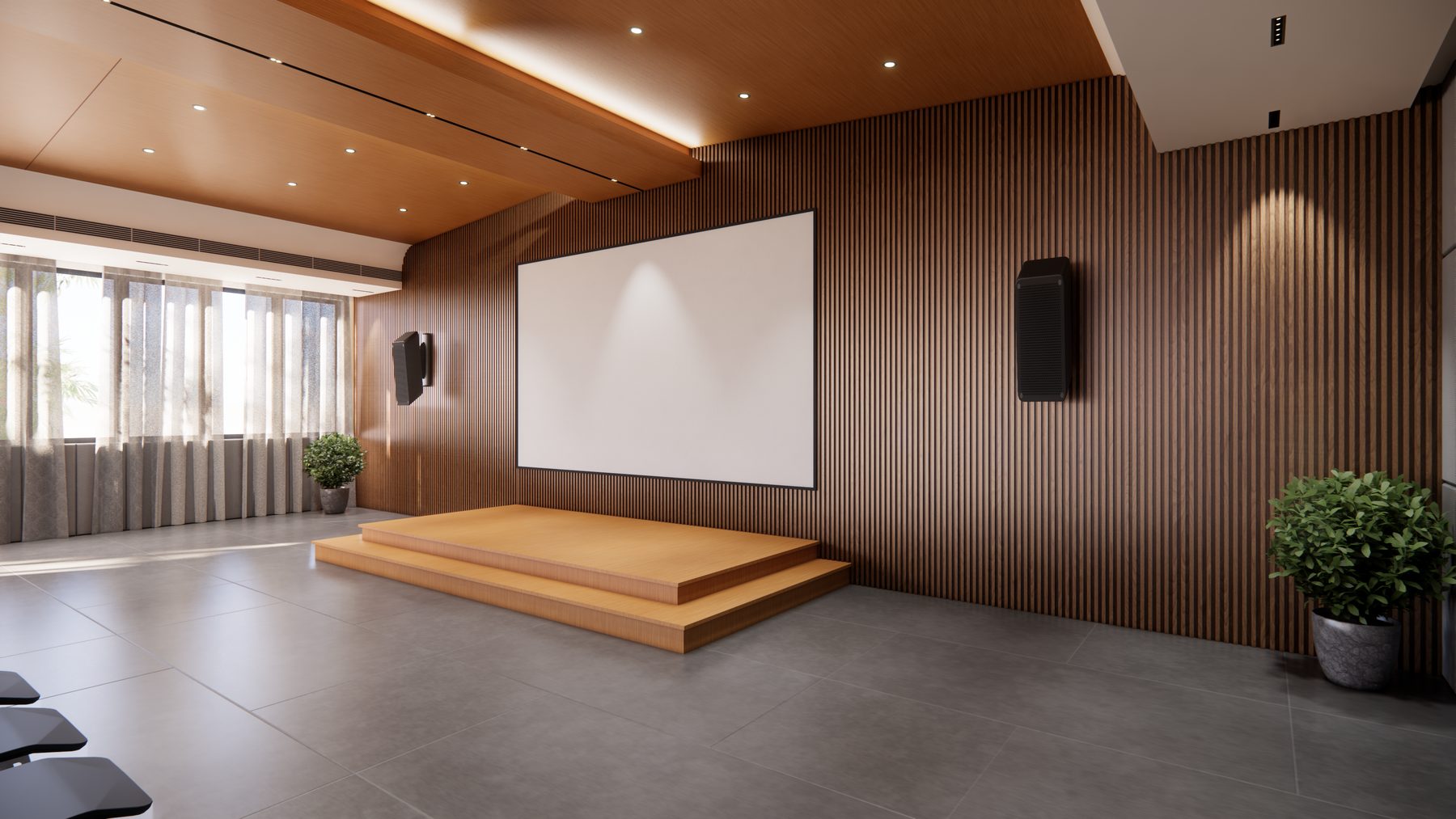
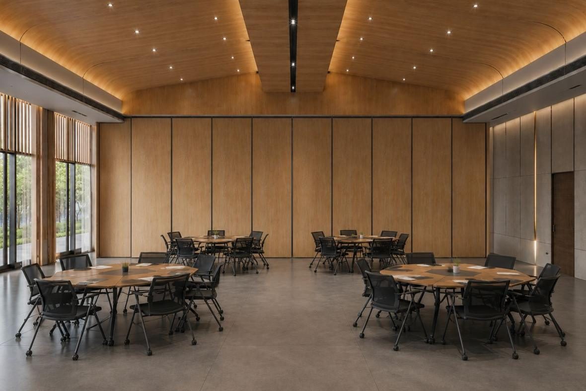
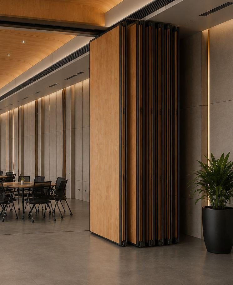
Coordinating an operable partition system with the ceiling, lighting and HVAC is exactly the interface that fails when design and build sit in different companies. Here they do not.
Brief, site appraisal, area programme, indicative budget band
Concept, 3D visualisation, material palette, GFC drawings, BOQ
Programme, site supervision, QA checks, progress reporting
Snag closure, as-built set, warranties, after-sales support
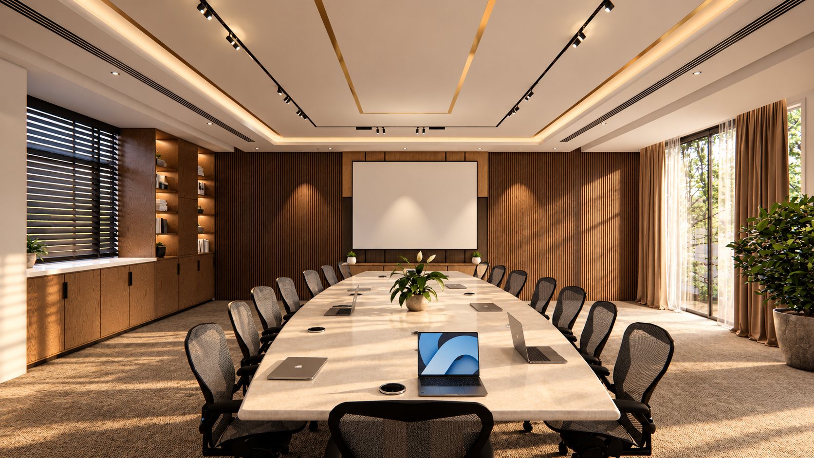
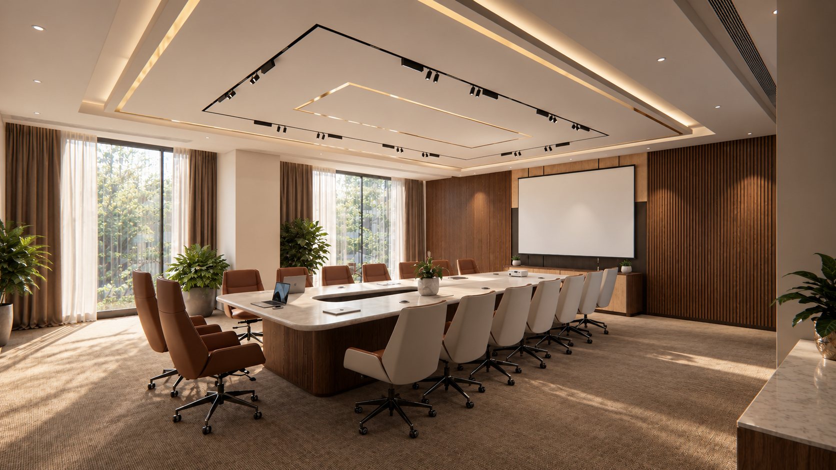
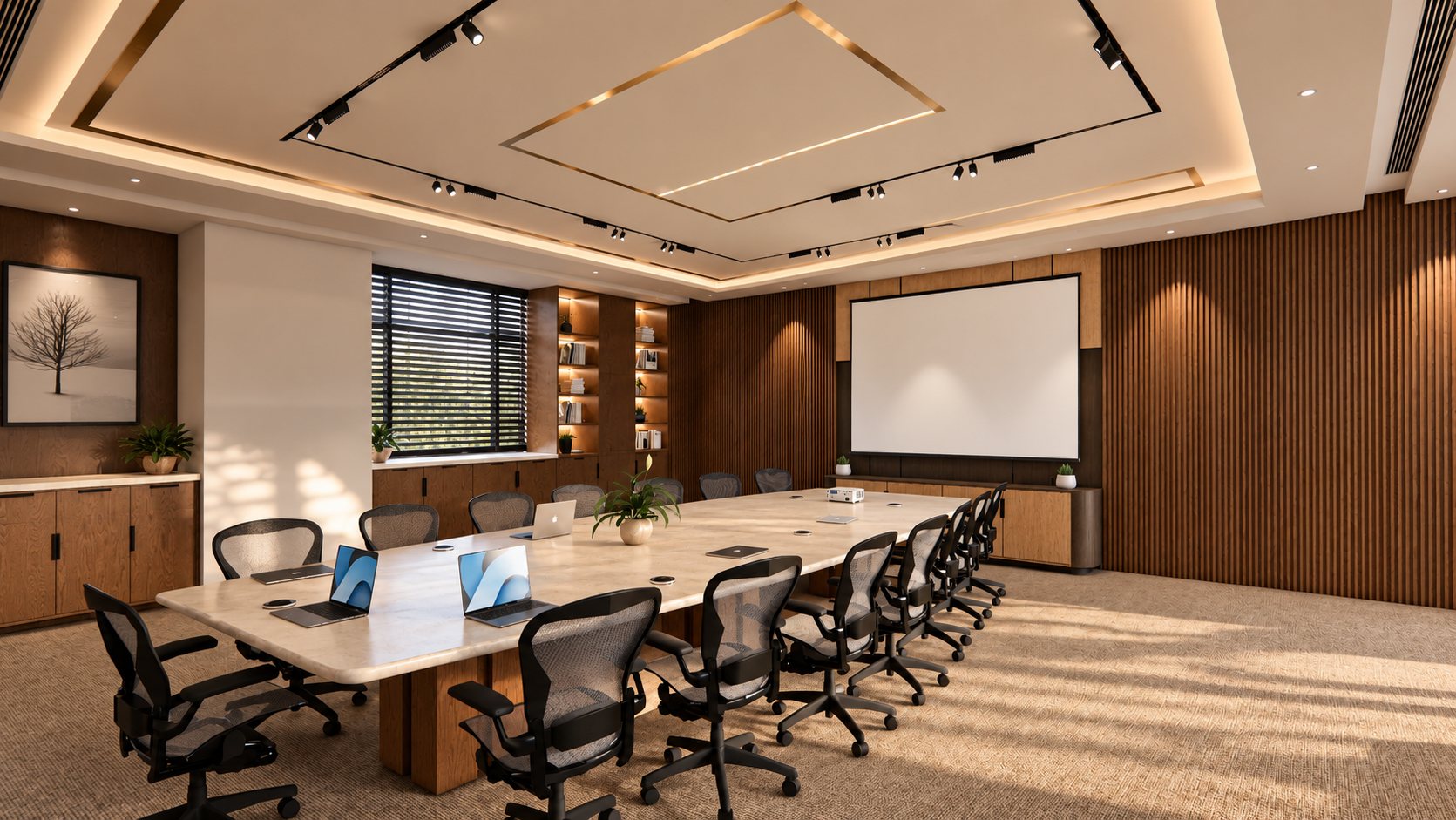
A college needed two conference rooms on one floor: one where the teaching staff and the HOD meet through the week, and one where the trustees and the board convene. Same size, same building — very different expectations.
We split roughly 2,000 sq ft into two equal rooms and gave them one detail language, so the floor reads as a single piece. Then we tuned each room to the people who sit in it — the table, the chairs and the number of seats.
The two rooms mirror each other across a shared wall. Each presentation wall sits on that wall, so the screens back onto each other and the window wall stays free for daylight. Storage sits by the windows; consoles and shelves line the entrance side.
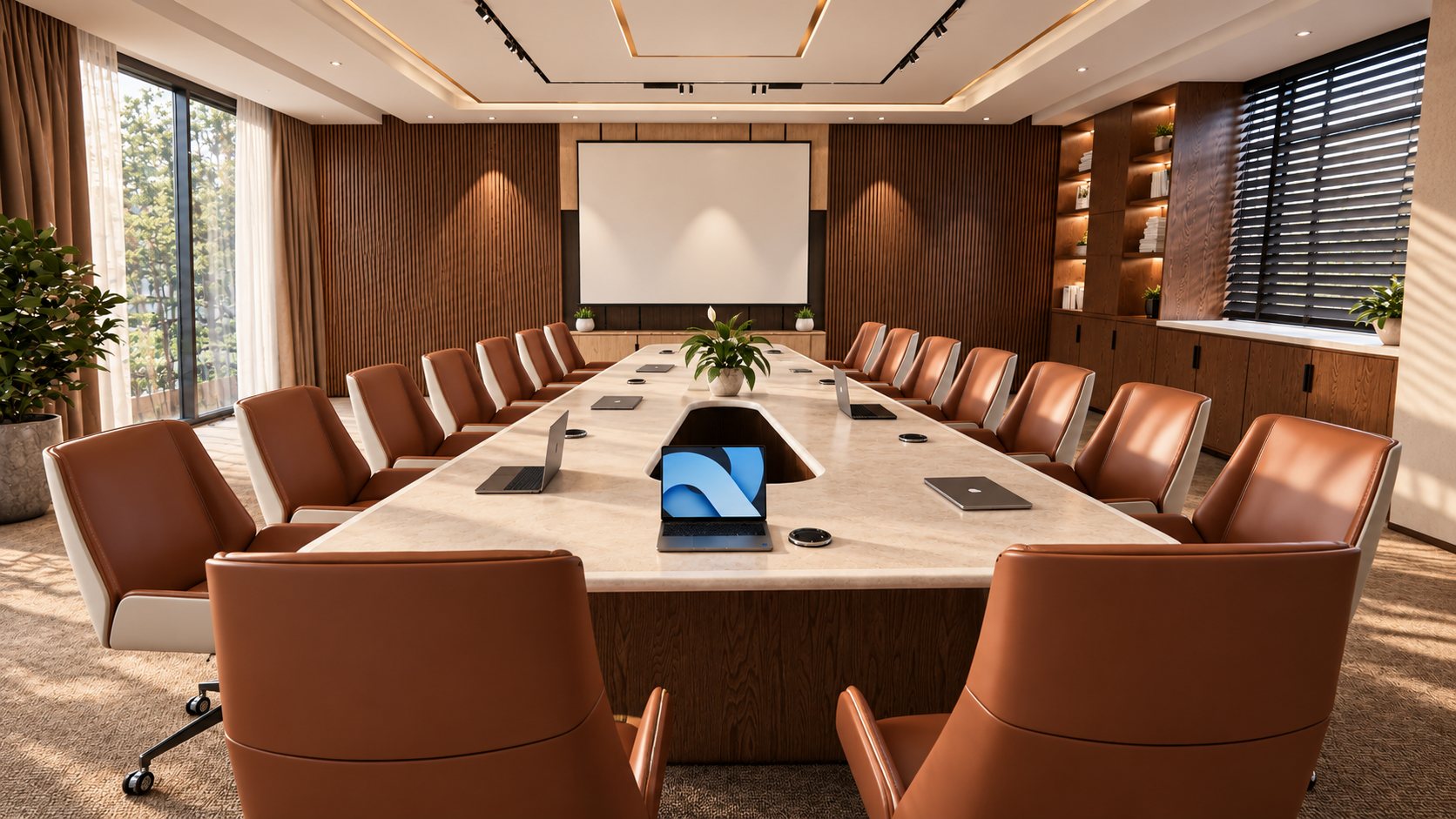
[Teaching staff & HOD / Trustees & board — to confirm]
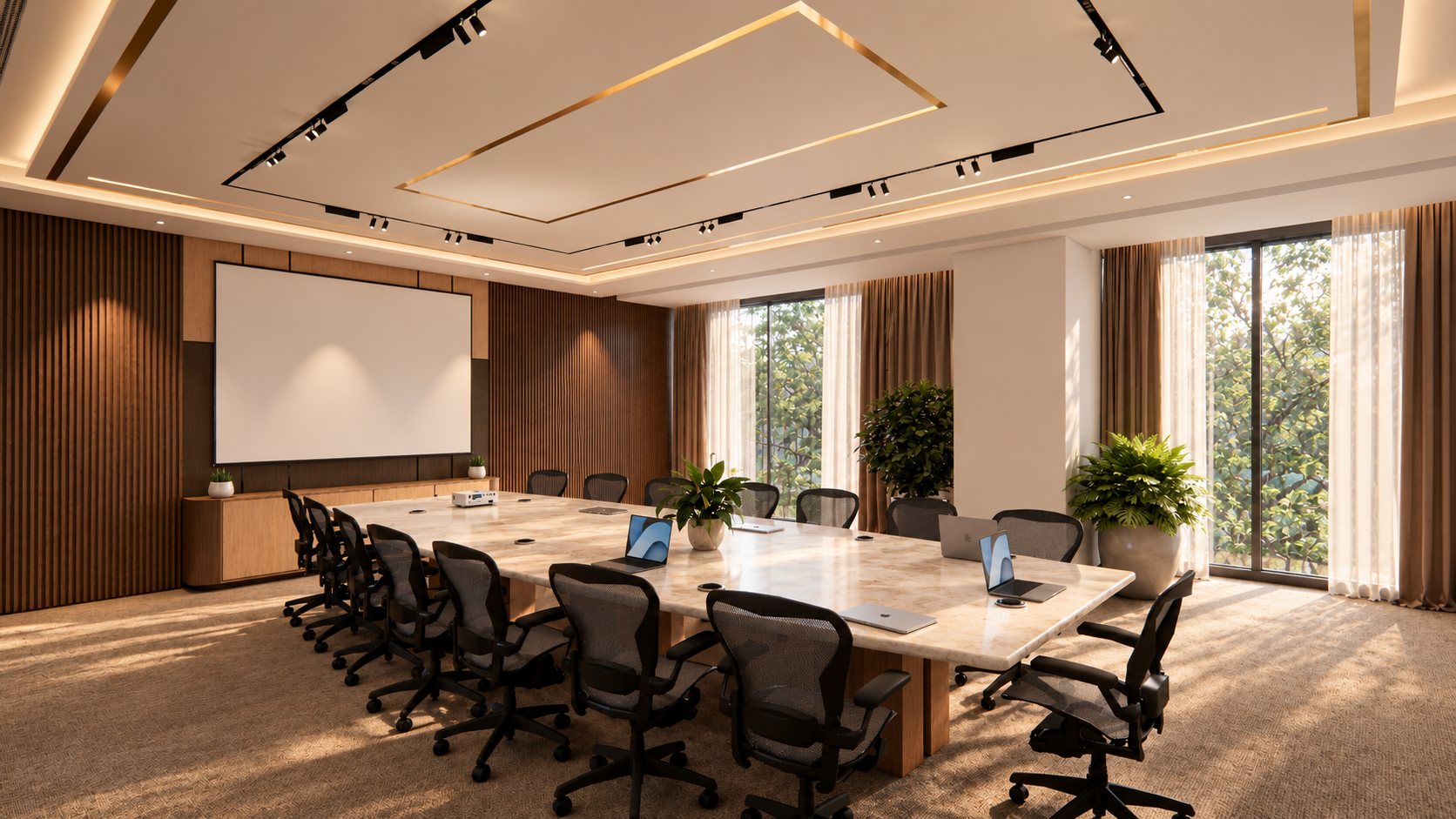
[Teaching staff & HOD / Trustees & board — to confirm]
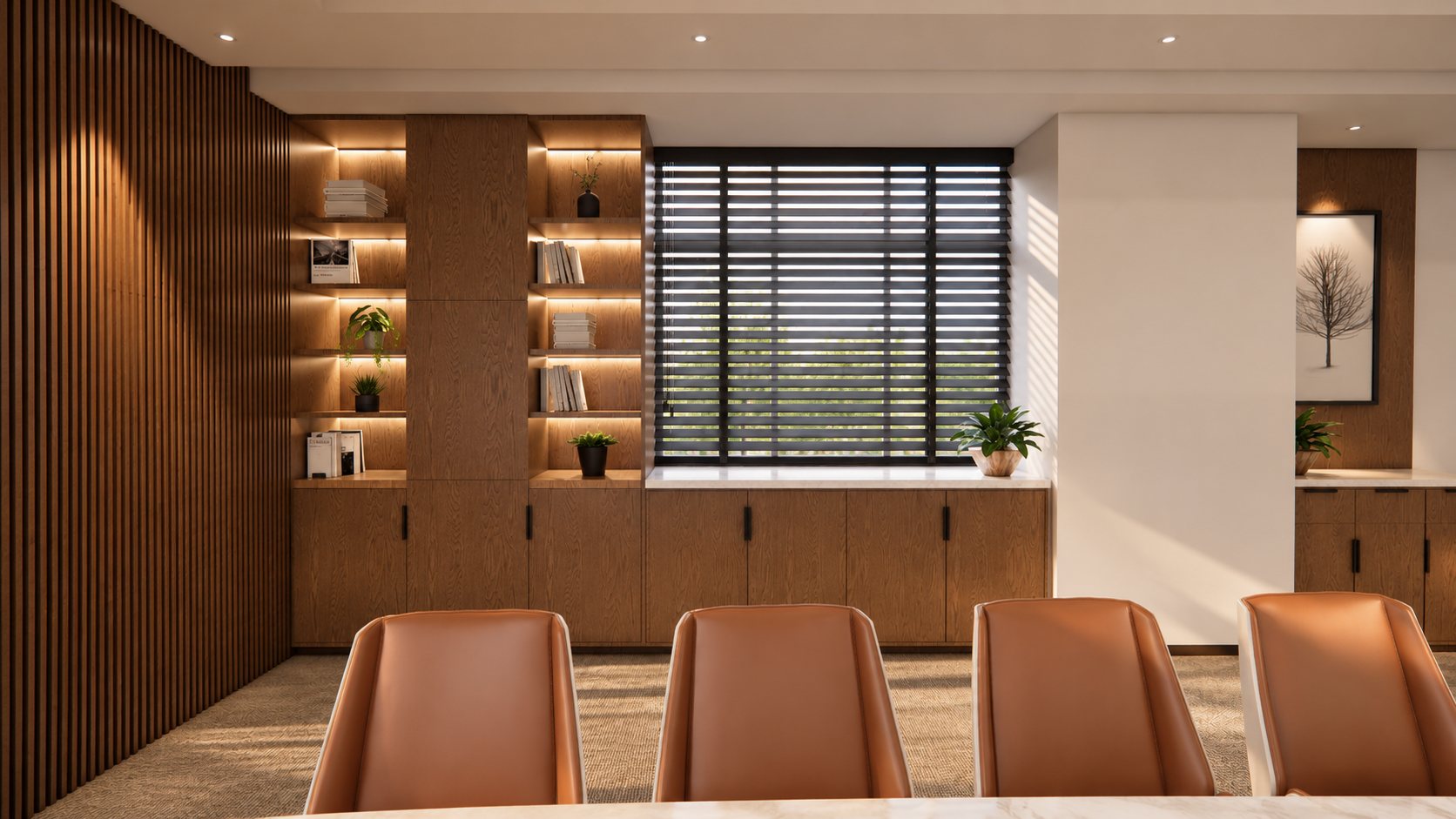
Both rooms share the same parts: fluted timber either side of the presentation wall, a stepped ceiling with cove light and track spots, full-height joinery with lit shelves, and stone-finish table tops. Building them as a pair keeps the floor consistent — and lets the two rooms be detailed, priced and installed as one package.
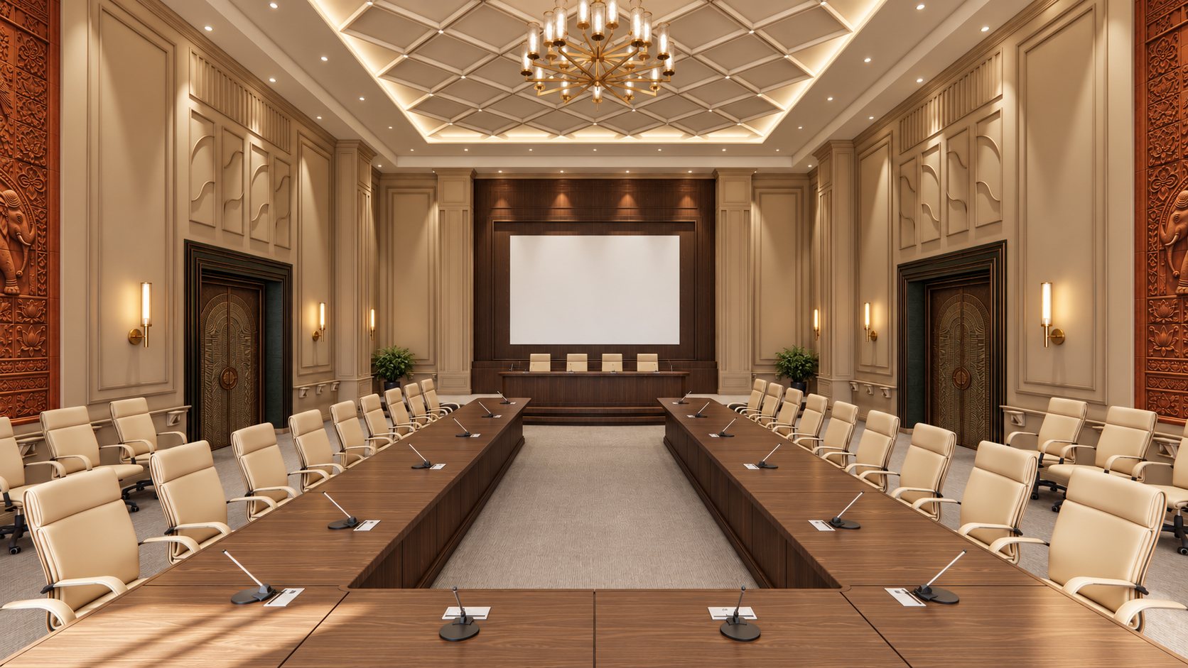
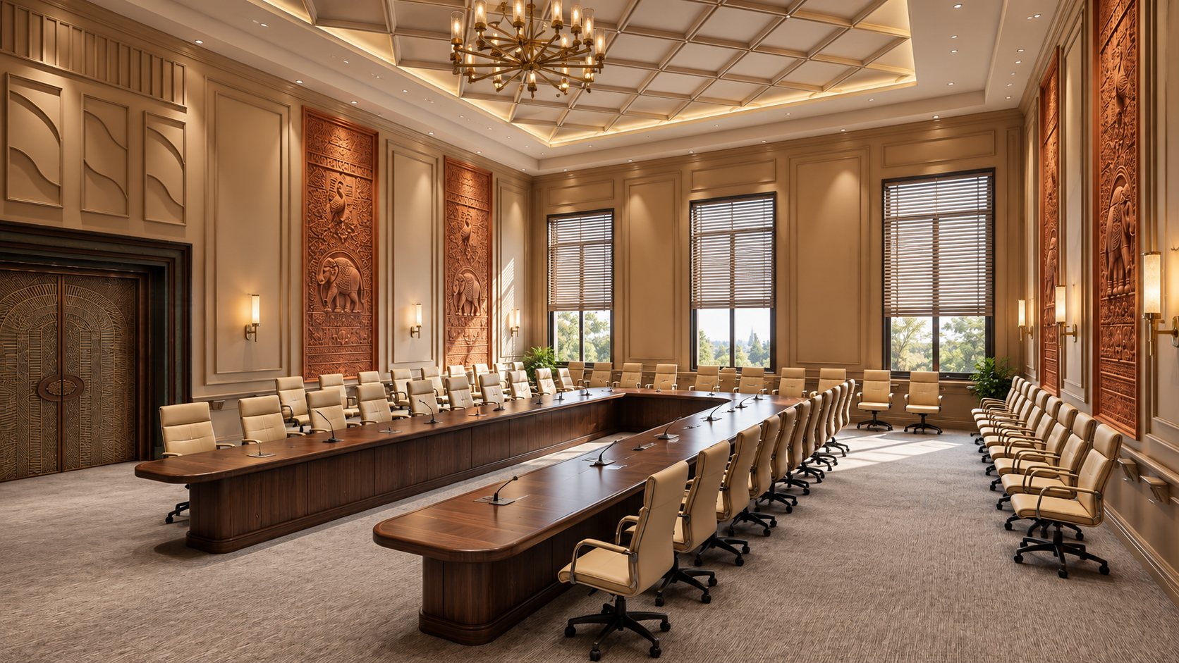
The main boardroom of the institute’s IT building — the room where trustees, investors and the board meet for the decisions that shape the institution. A boardroom is a physical statement of an institution’s vision and values; this one had to carry that weight.
With respect for the heritage and craft of our country, we proposed a room at the scale of its 7.3-metre volume: calm, disciplined walls as a backdrop to ceremony, terracotta murals as its cultural heart, a coffered ceiling to bring the height down to human scale, and doors that announce the room before you enter it.
A raised podium at one end carries the presentation wall and a head table. The board sits around a central hollow table; further seats line both long walls and the window wall for advisors and observers. Two entries face each other across the room, so arrivals never cross the presentation.
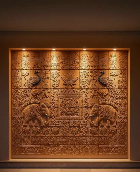
Indian motifs: lotus, peacock, elephant, temple geometries, mandalas.
The murals draw on India’s artistic legacy — motifs that have long stood for wisdom, prosperity, knowledge and leadership. Set between the window bays, they bring warmth, texture and storytelling into the room, and break the scale of its long walls.
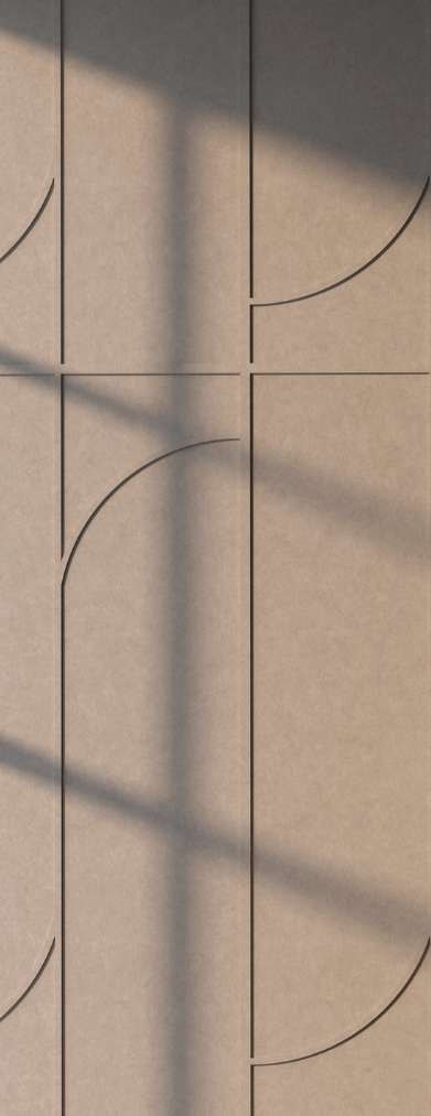
Large-format acoustic panels with subtle geometric reliefs.
The wall architecture is a disciplined backdrop to the ceremony of the room. Large-format acoustic panels in MDF give visual restraint and better speech clarity — so presentations, lectures and discussions carry clearly across an 18-metre room.
A coffered ceiling grid gives the room order and proportion; each recessed module casts shadow lines that shift through the day, and the pattern makes the tall volume feel intimate and focused without losing its grandeur. At the entries, Art Deco-inspired doors with metal inlays and monumental proportions set a ceremonial threshold.
A tailored palette: warm stone neutrals, a deep charcoal, and the terracotta of the murals.
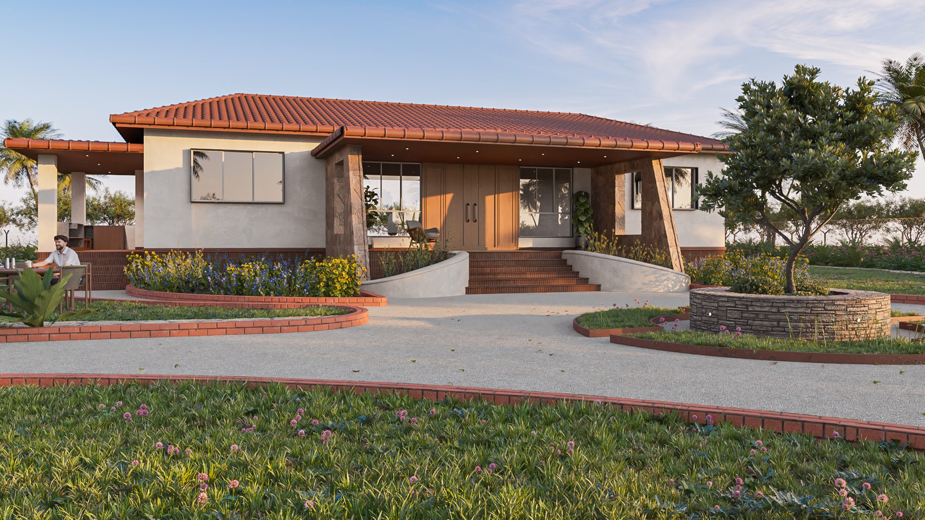
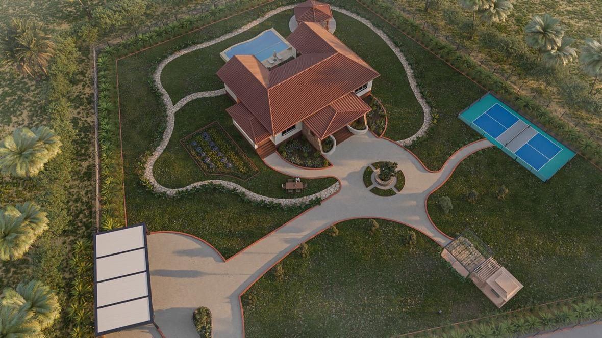
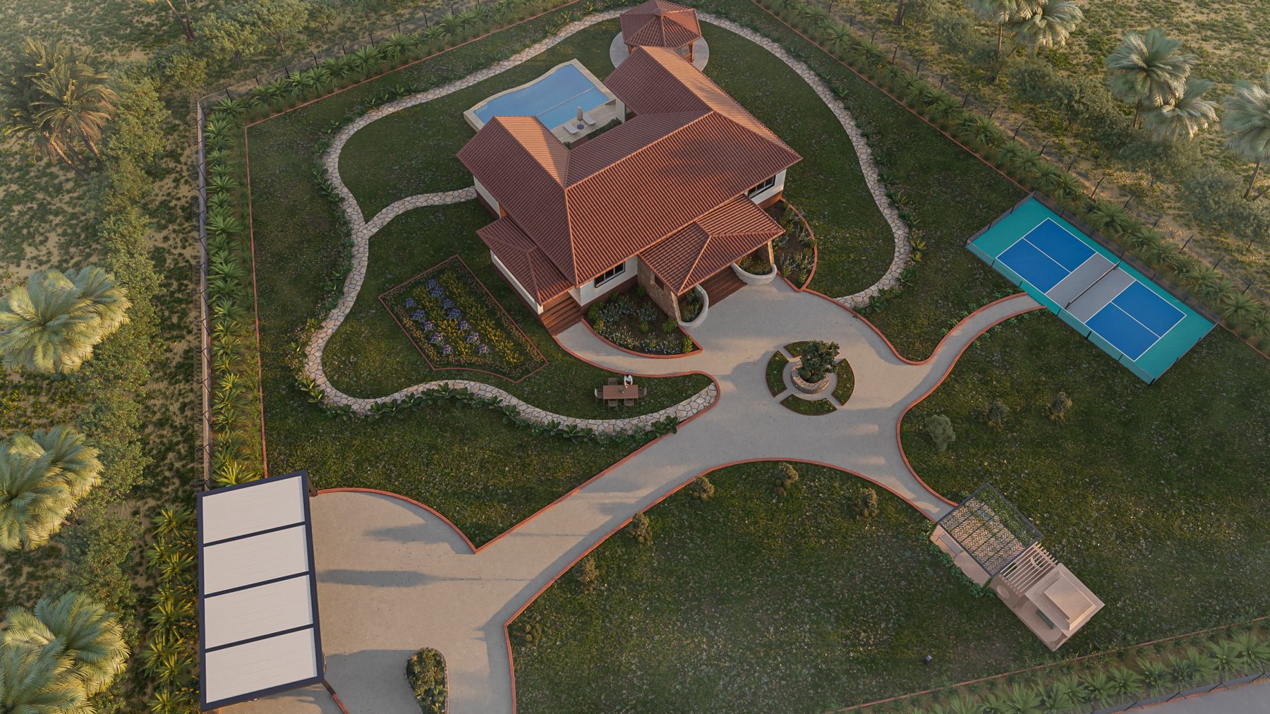
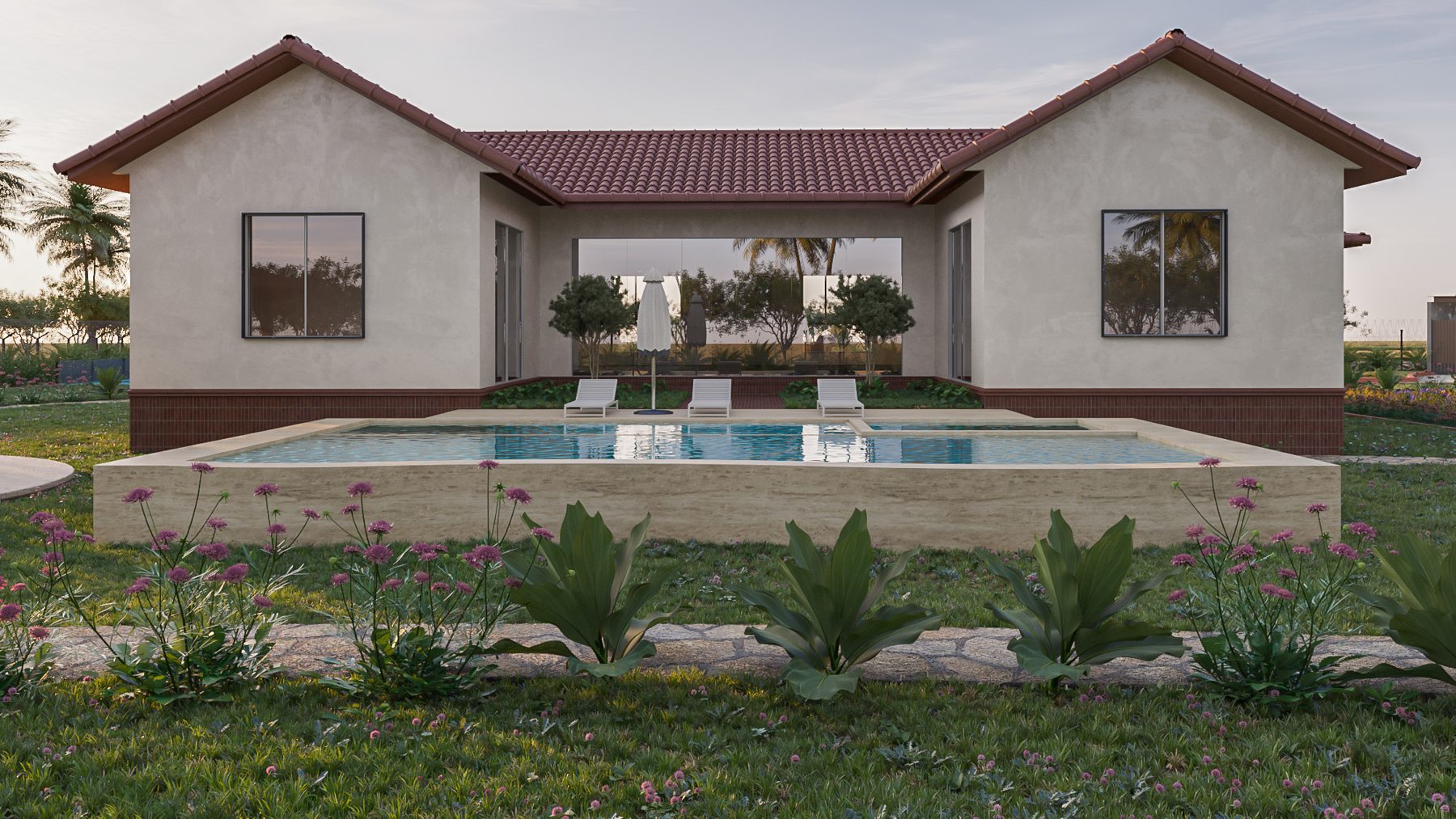
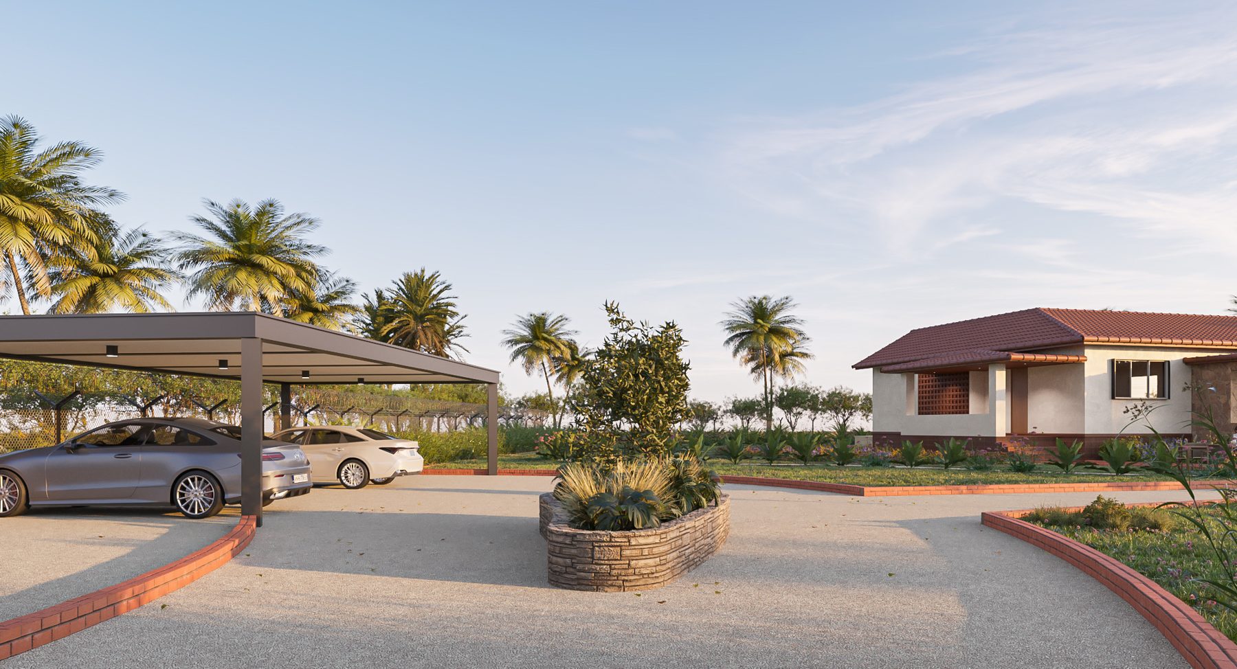
A family wanted somewhere to come back to — an hour from the city, on its own acre of land. Not a weekend villa, but a second home: for get-togethers, long lunches, festivals, and the kind of family time city life rarely leaves room for.
We planned the whole acre as one design. The 2,250 sq ft home sits at its centre; around it, every part of the site is given a use — water, play, shade, a kitchen garden, and a temple that opens the family’s home to the village.
You enter from the road into a paved drop-off with parking and staff quarters, then walk a drive lined with a flower garden to the focal tree at the house entrance. The mandir sits on axis below it; the gazebo and an open lawn for parties and events take the far corner. Behind the house, the pool — and around it all, a looping garden walkway past the vegetable garden and outdoor dining, with trees along every boundary.
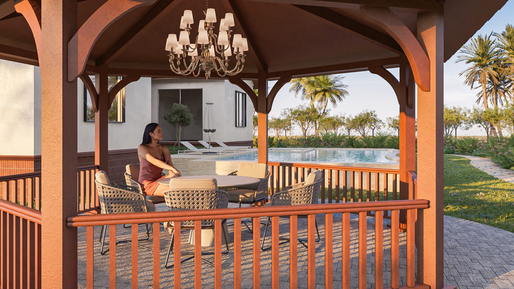
The pool sits against the house, with an open-sided timber gazebo beside it — a shaded table for long lunches, card games and evenings that run late. The house opens straight onto both, so no one is ever far from the gathering.
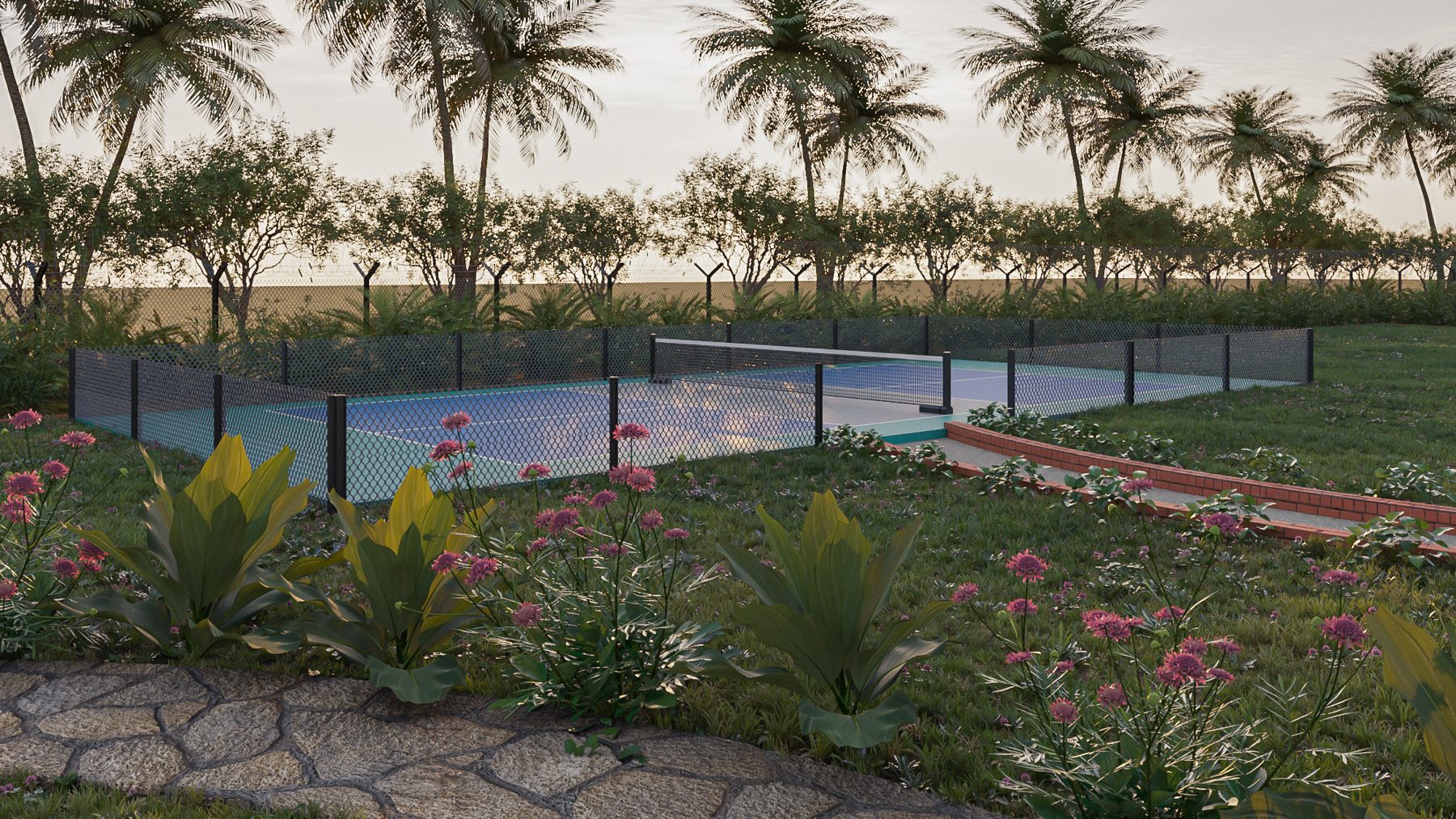
A fenced multi-purpose court gives the children — and the competitive uncles — a place to play, set away from the house so the noise of a match never reaches the verandah.
Coconut trees ring the plot, and the land around the house is already planted with onions, tomatoes and chillies. The idea is simple: stay a week, and the family can live largely off what the land gives — the beginning of a self-sufficient home.
The best part of the site is its temple. Set along the drive, with its own approach and a shaded court, it lets the family host religious events and festivals for the village — turning a private retreat into a place the whole community gathers at.
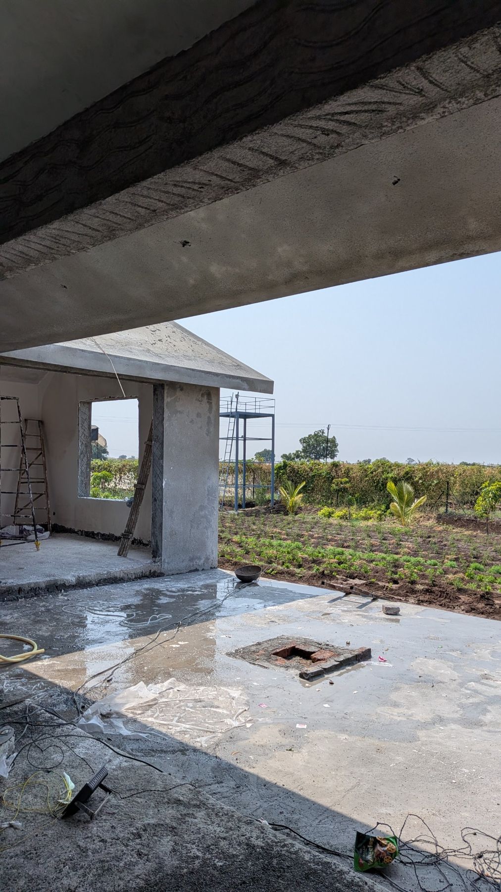
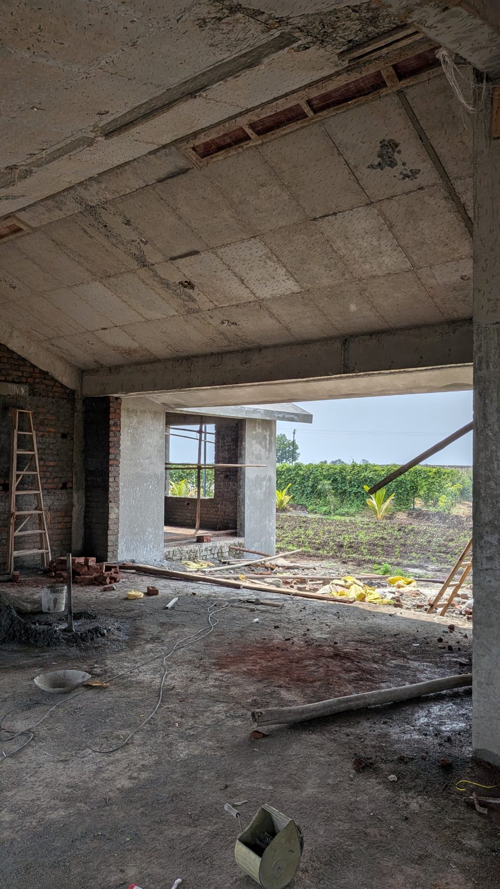
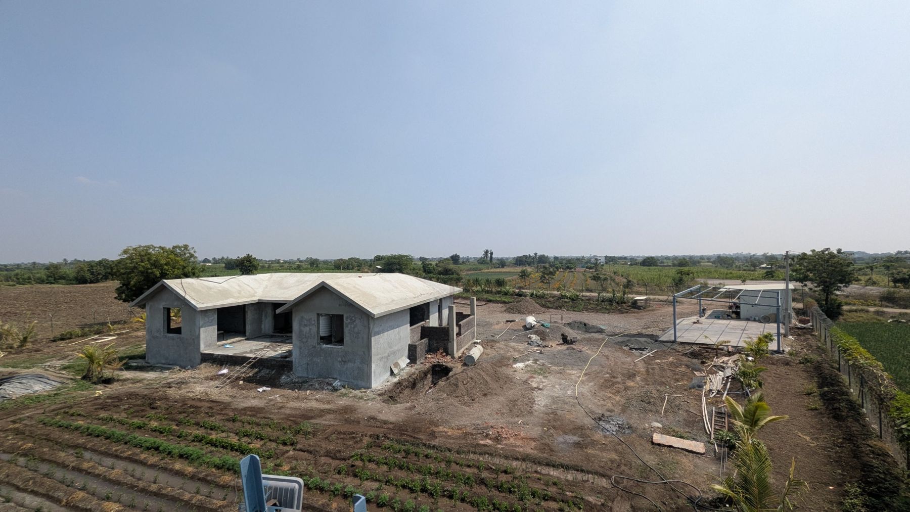 Site photo
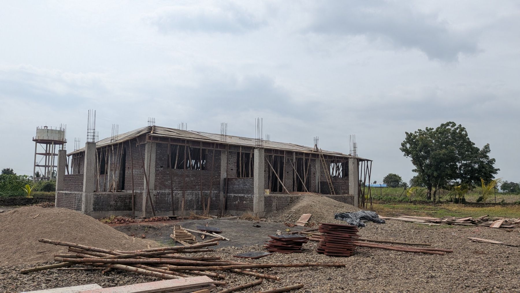 Structure
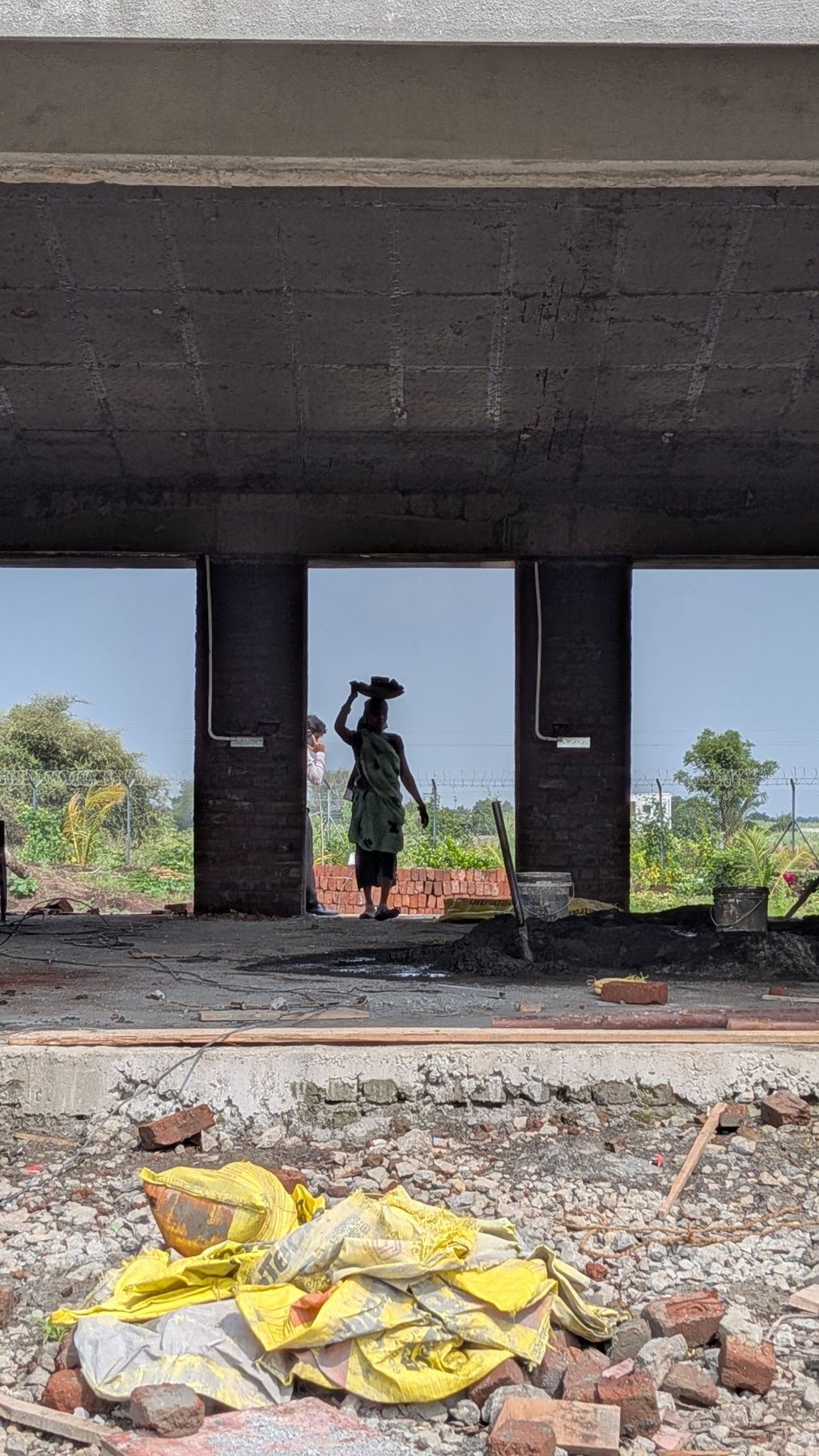 The team
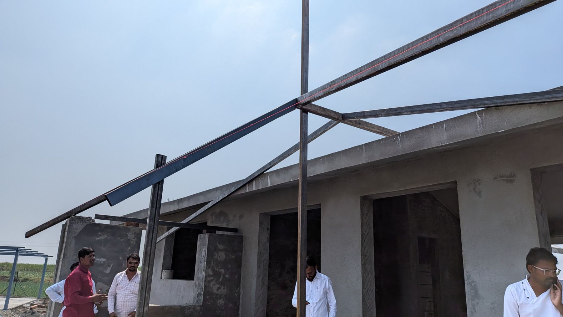 Set-out
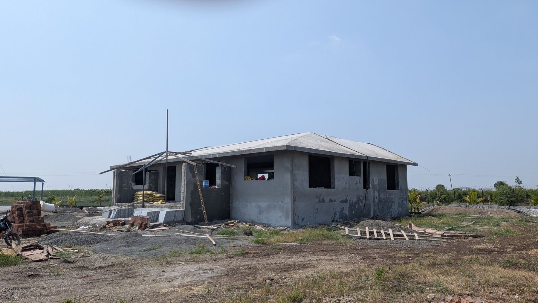 Plaster
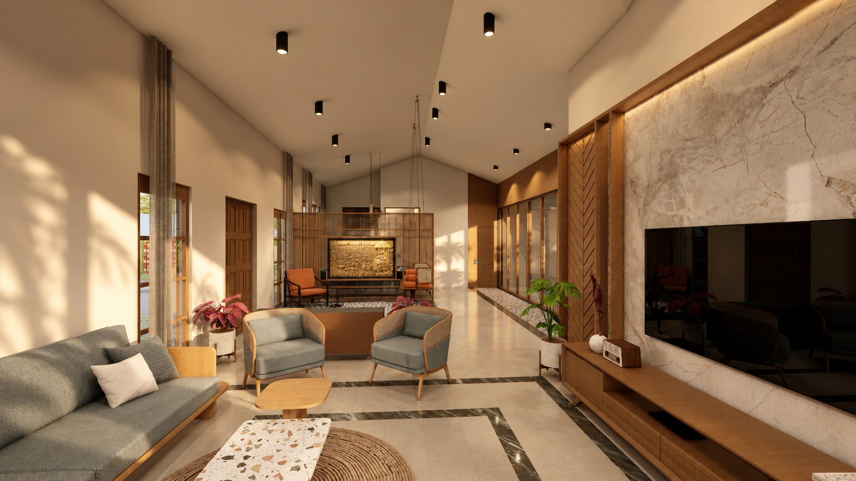
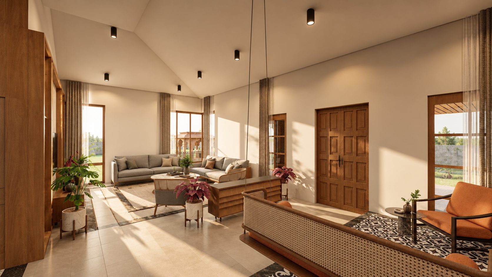
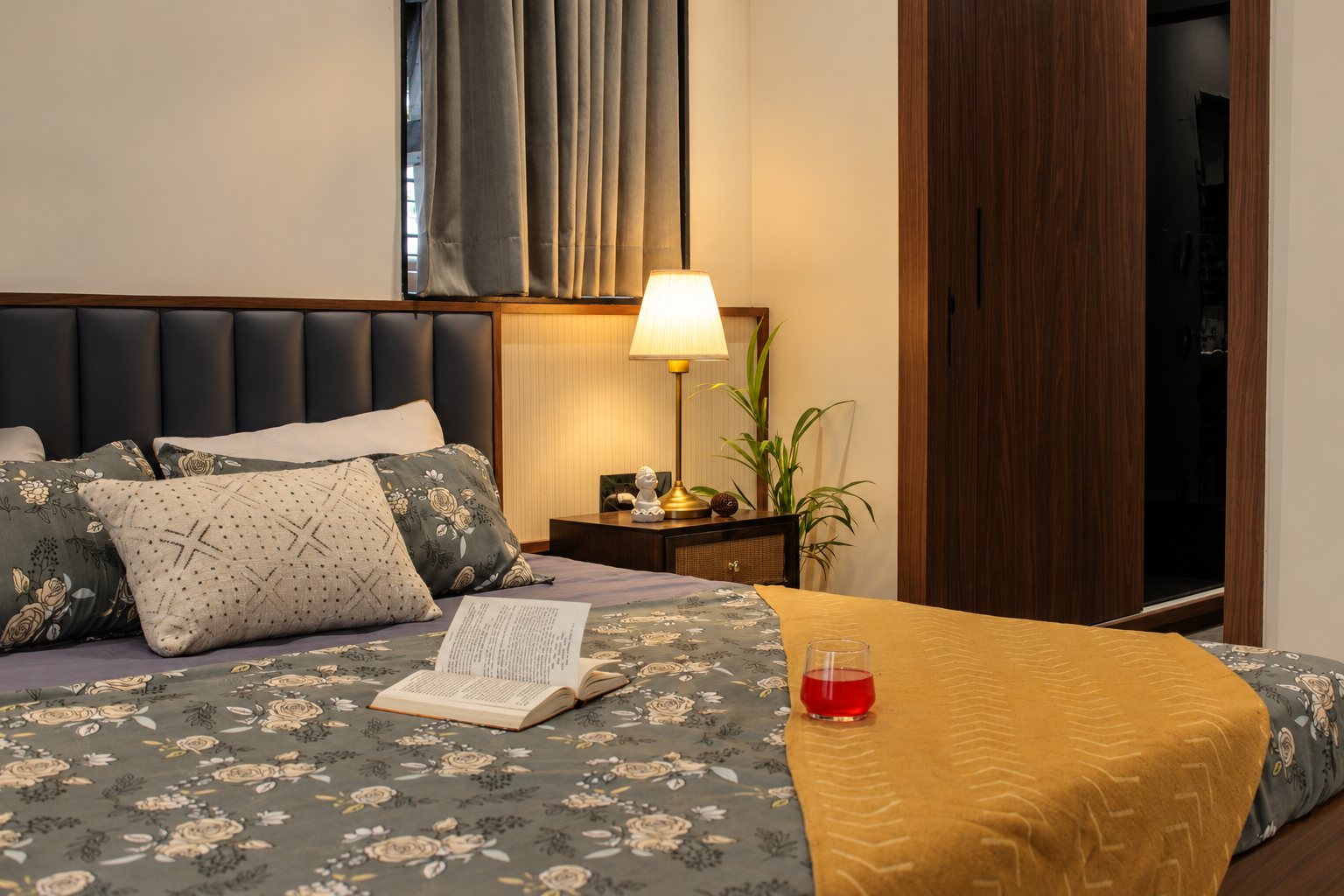
The interiors of a family’s farmhouse — a home the family comes to in order to slow down. We drew on the traditional Indian home: a swing at its heart, a courtyard to sit beside, patterned tile underfoot, and timber and stone that grow better with age.
Every material was chosen to be soft to the eye and easy to live with: linen curtains that move with the breeze, cane and rattan instead of hard upholstery, warm timber joinery, and stone kept to the surfaces that need it. Nothing shouts; the light through the courtyard does most of the work.
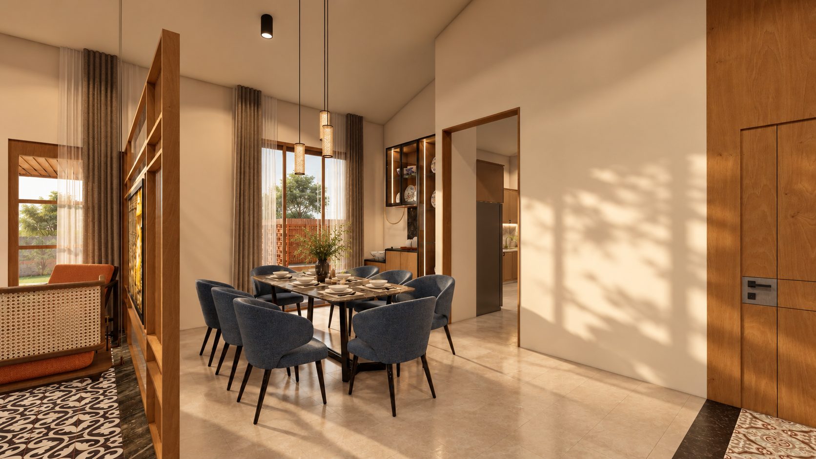
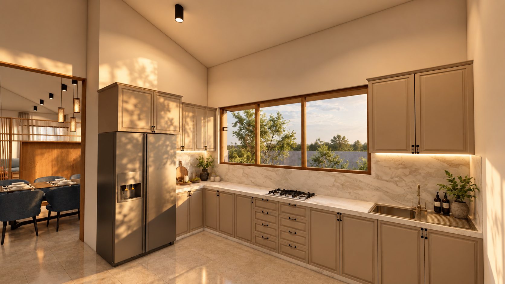
Two bedroom wings frame an open courtyard that faces the pool and the lawn. Between them, the dining room looks into that courtyard through full-height timber glazing; below it, a 12-metre living room runs the width of the house, with the jhoola at one end. The kitchen sits beside dining, with an outdoor kitchen just beyond.
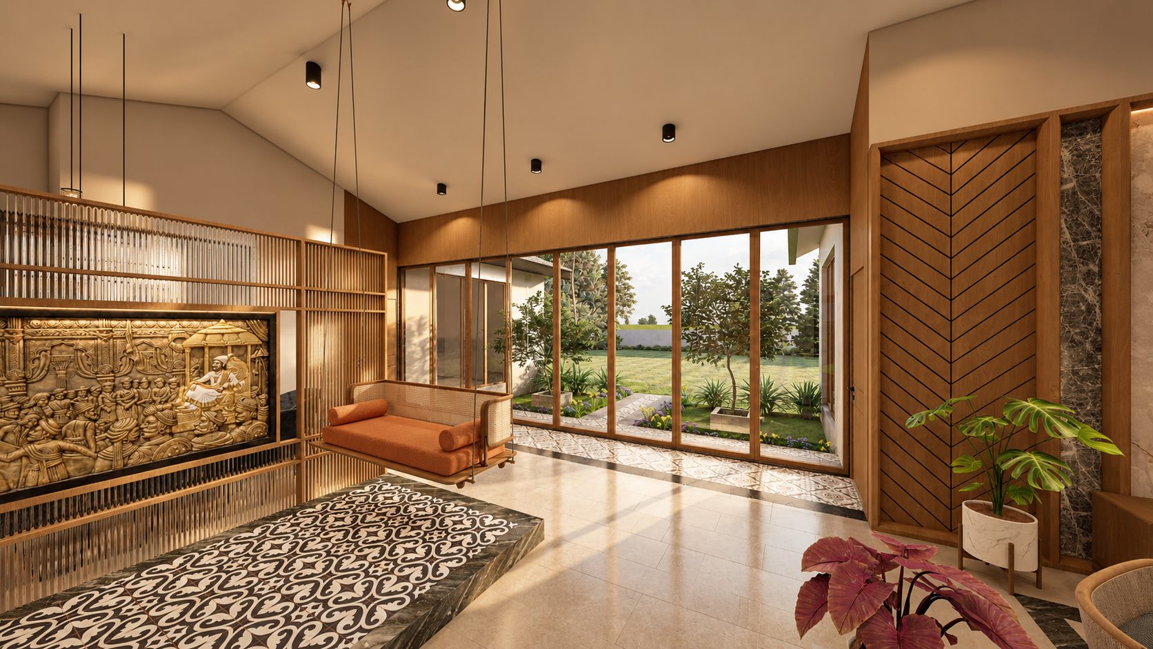
A cane jhoola hangs from the pitched ceiling, set on a raised platform of patterned cement tile. Behind it, a carved relief panel sits within a screen of timber battens; ahead, the courtyard glazing opens the room to the garden. It is the seat everyone ends up on.
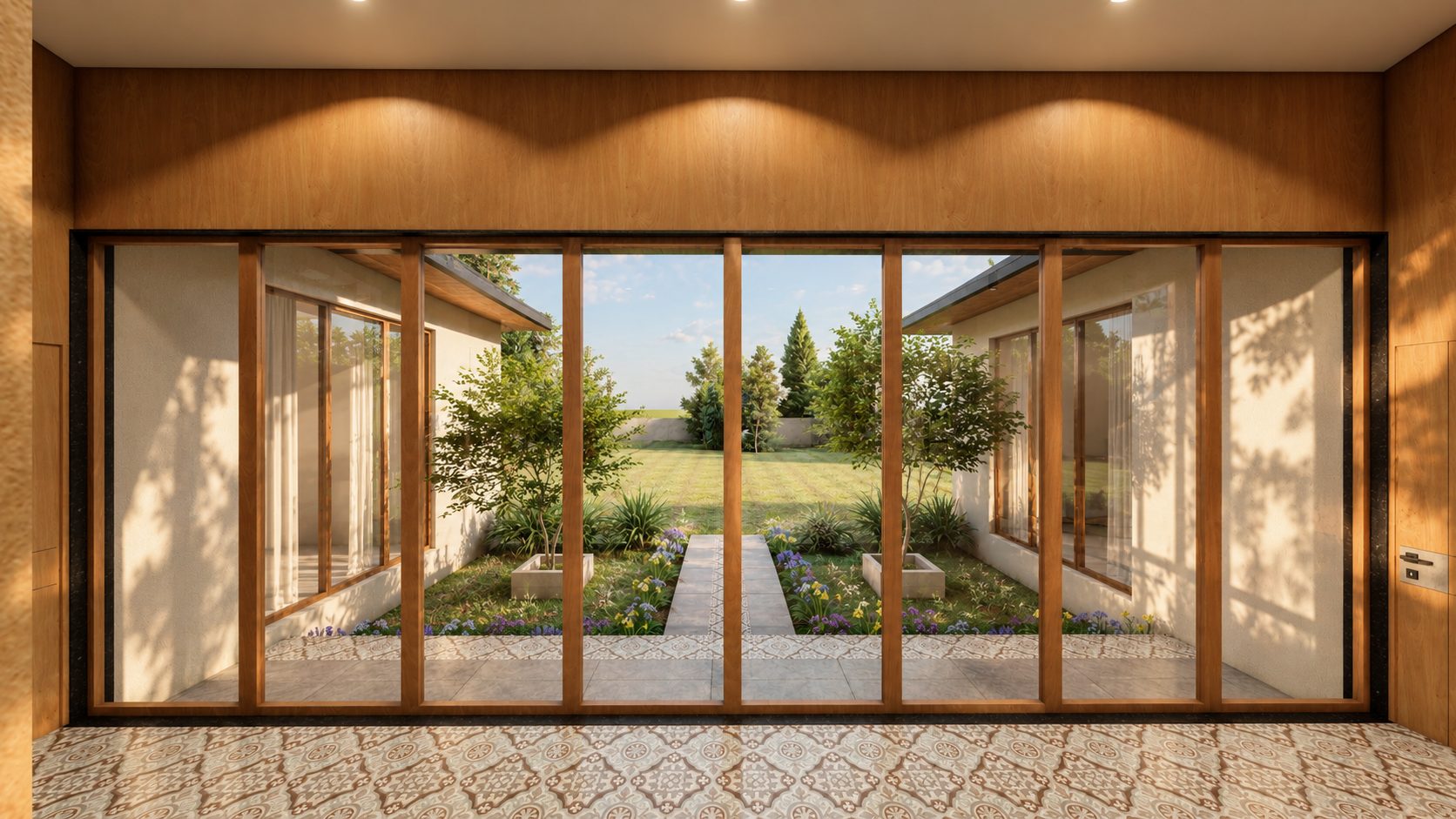
Full-height timber-framed glazing turns the courtyard into a room of its own: planters, a stone path, flowering beds, and the lawn beyond. It brings daylight and breeze deep into the house and gives every room a view of green.
Low linen sofas, cane-backed chairs and solid timber doors under a pitched white ceiling. Sheer and linen curtains soften the tall windows, and a bordered stone floor holds it all together. A room for long conversations and afternoon naps.
 Shell
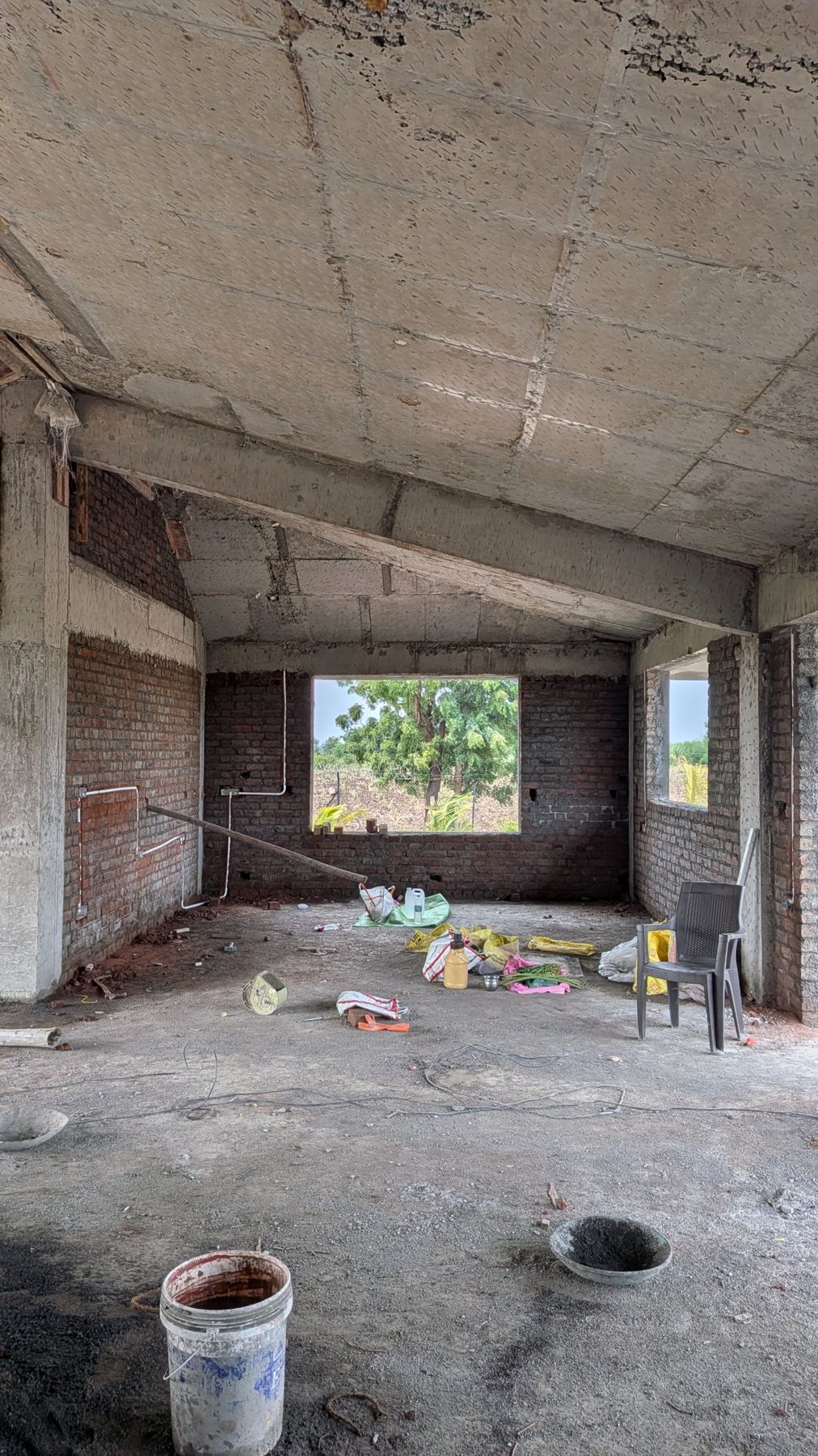 Services
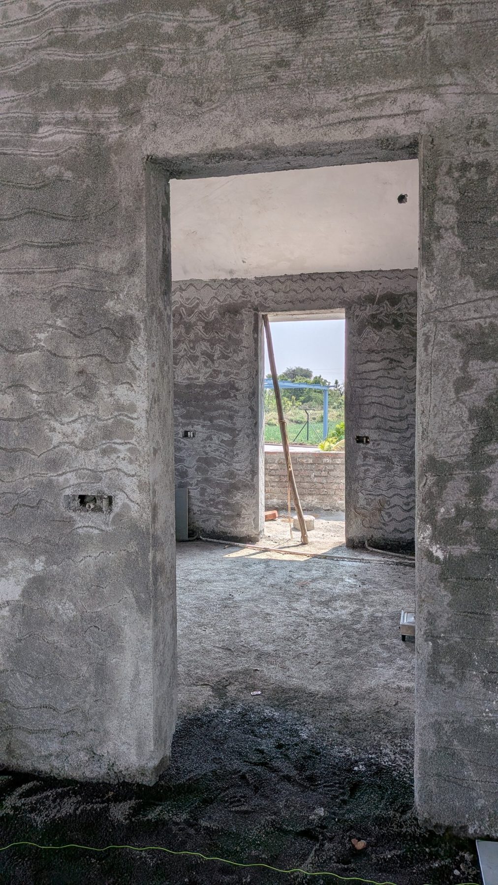 Plaster
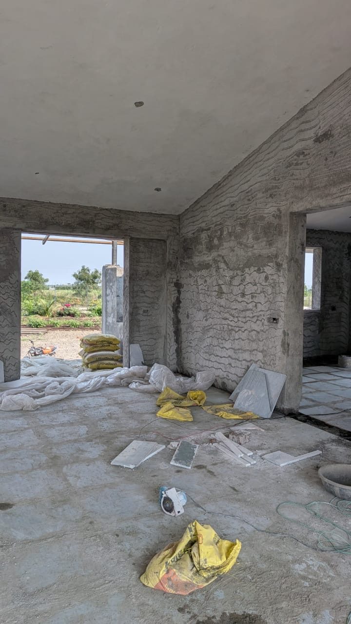 Flooring
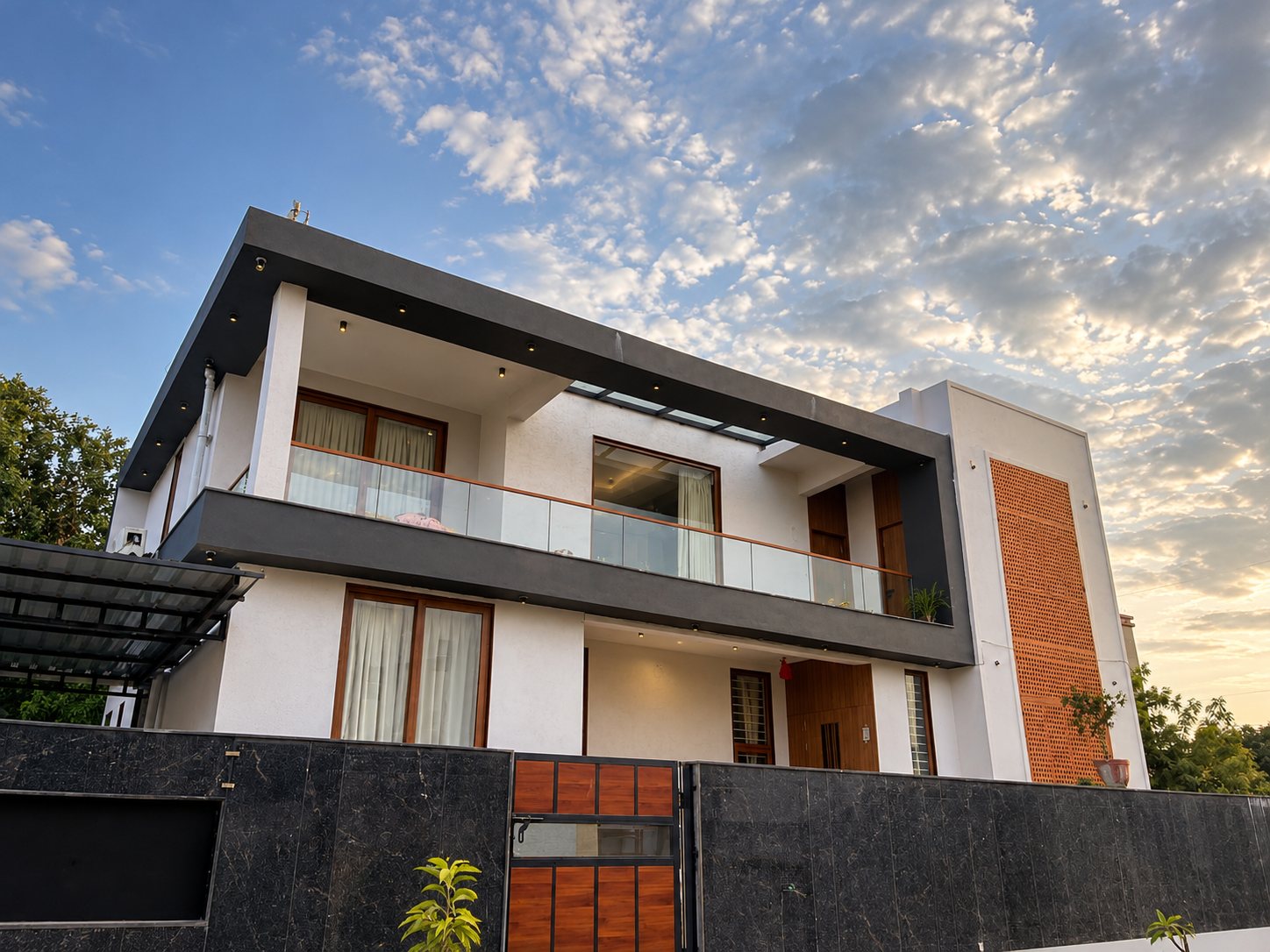
A family home, drawn and built by the same team — the shell and the rooms inside it treated as one design. The same few materials carry from the street to the bedside: white walls, warm walnut timber, cane, stone and soft linen.
Outside, a deep charcoal frame wraps the upper terrace, a terracotta jaali screens the stair tower and filters the western light, and a stone-clad boundary wall holds the house to the street. Inside, the palette quietens — so the light, the textiles and the people living there do the talking.
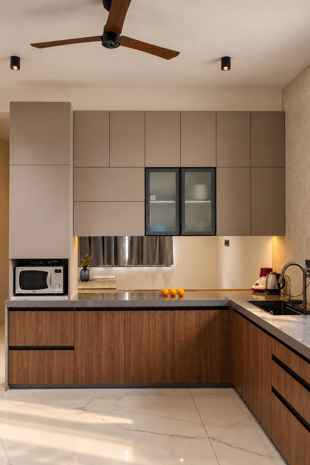
Walnut base cabinets with continuous handle grooves, taupe tall units to the ceiling, a fluted-glass cabinet for everyday crockery, and a grey stone counter that takes daily wear. Joinery made to fit, and installed by our own team.
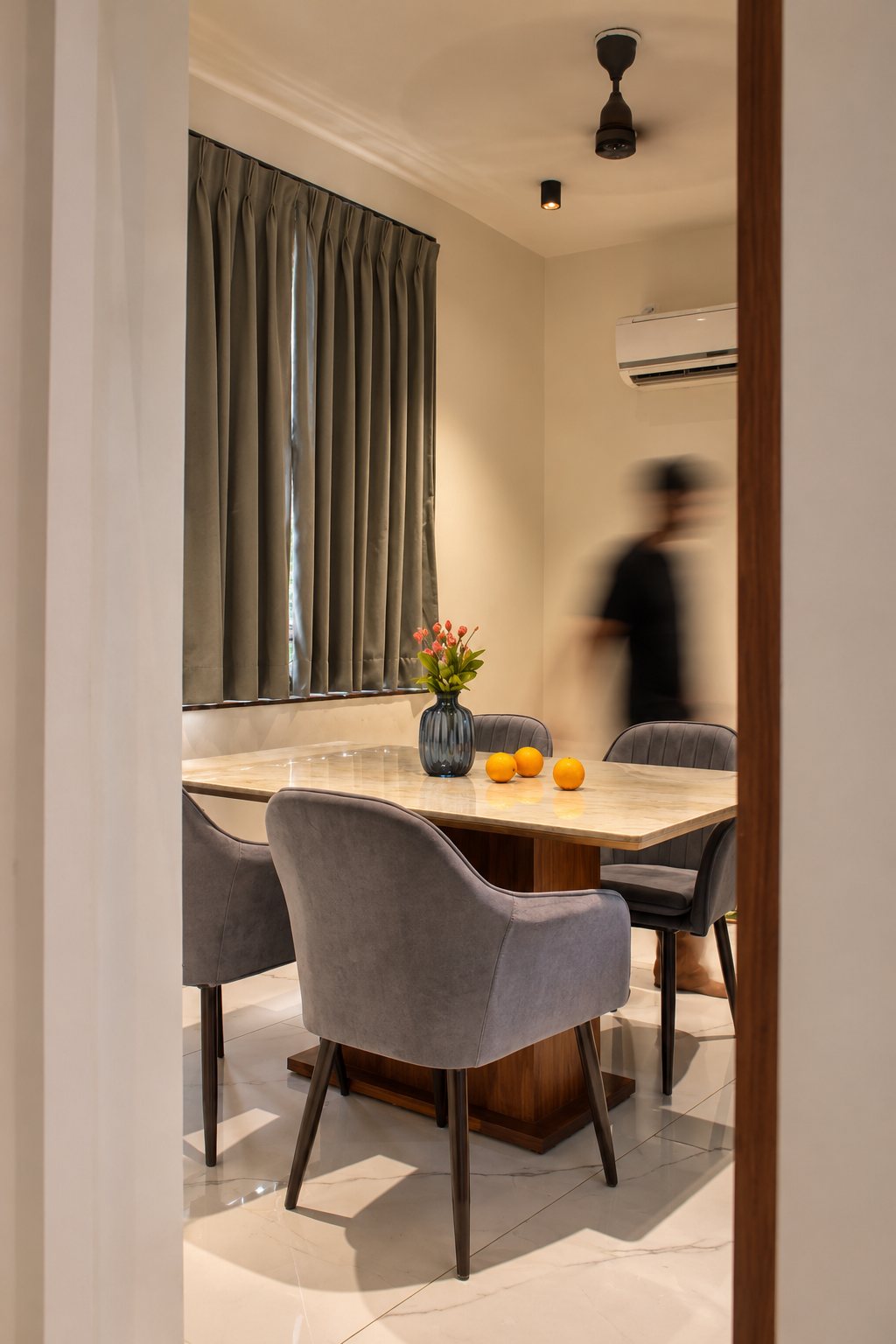
A stone-topped table on a solid walnut pedestal, soft upholstered chairs and heavy drapes — a room framed by the doorway, made for unhurried meals rather than for show.
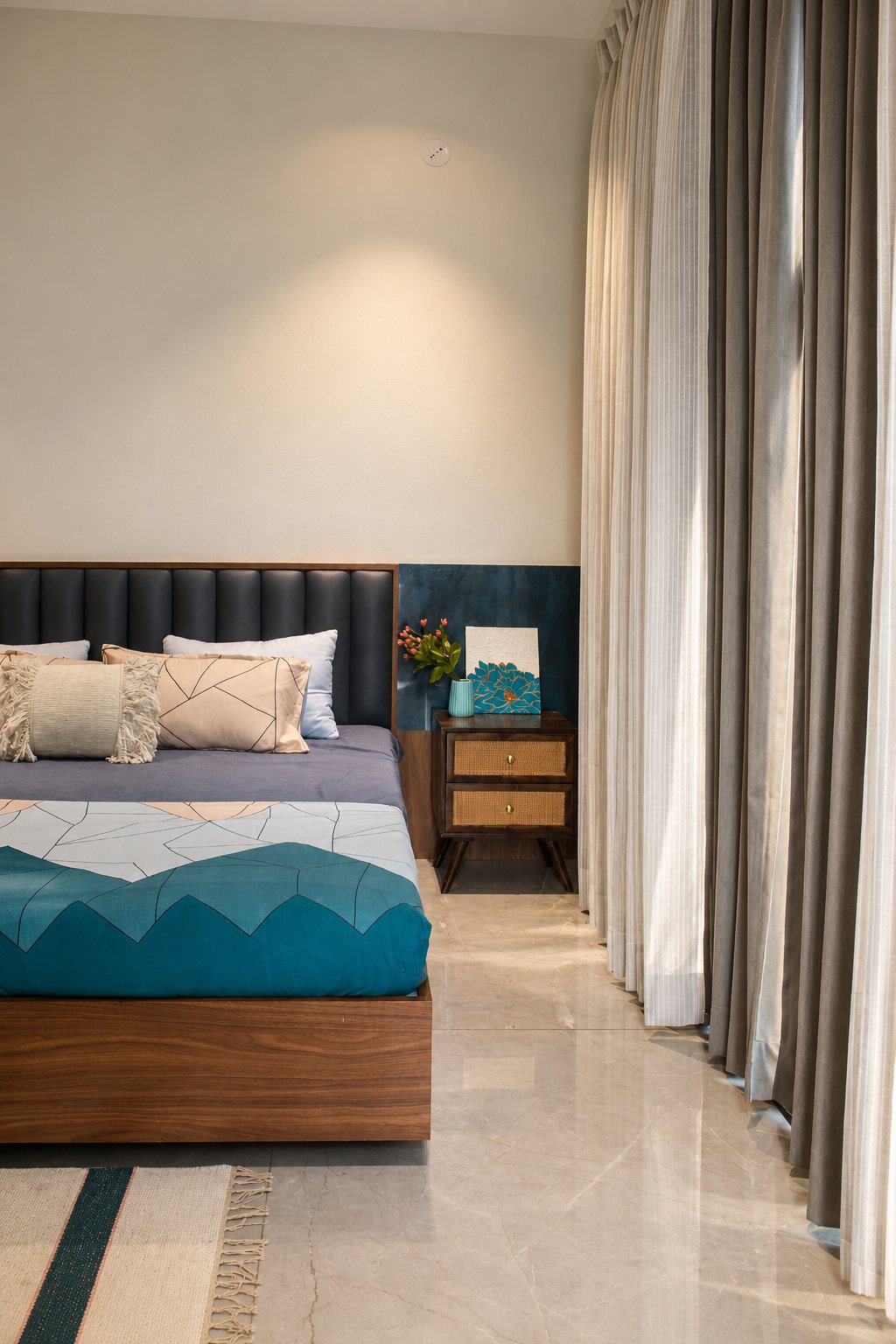
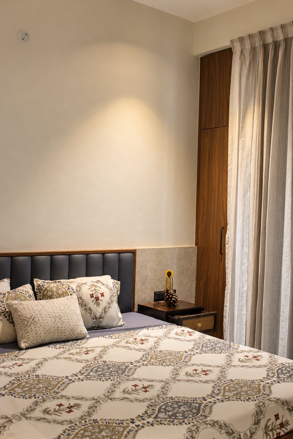
The same team drew the facade and fitted the bedside tables. That is why the house reads as one.
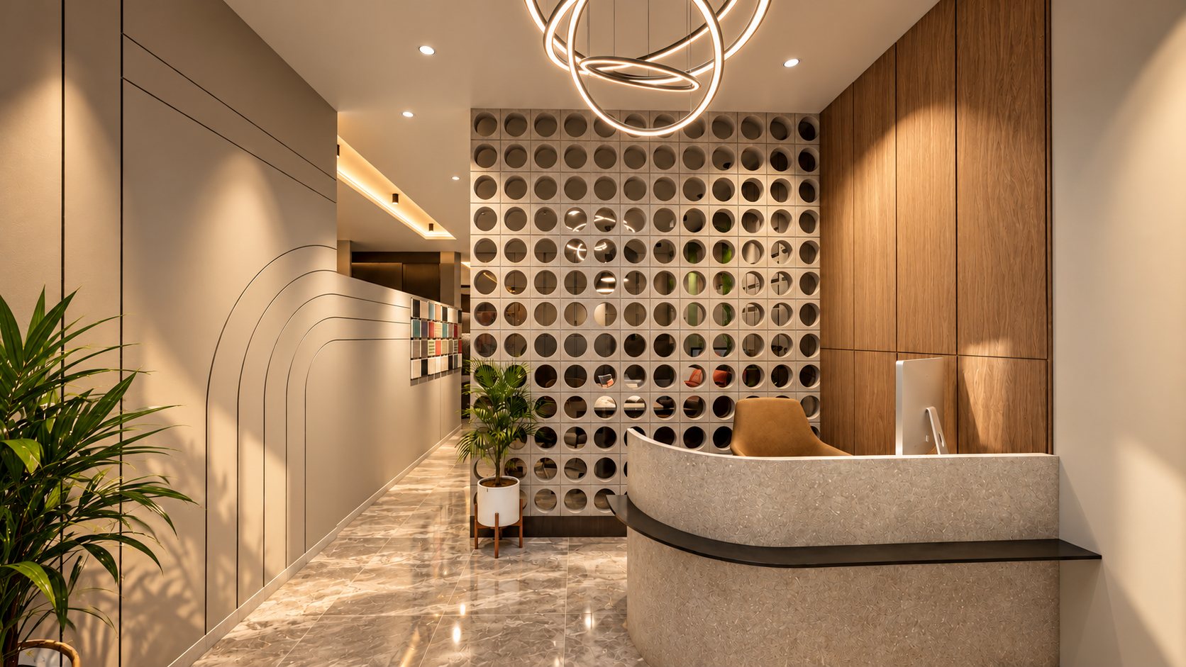
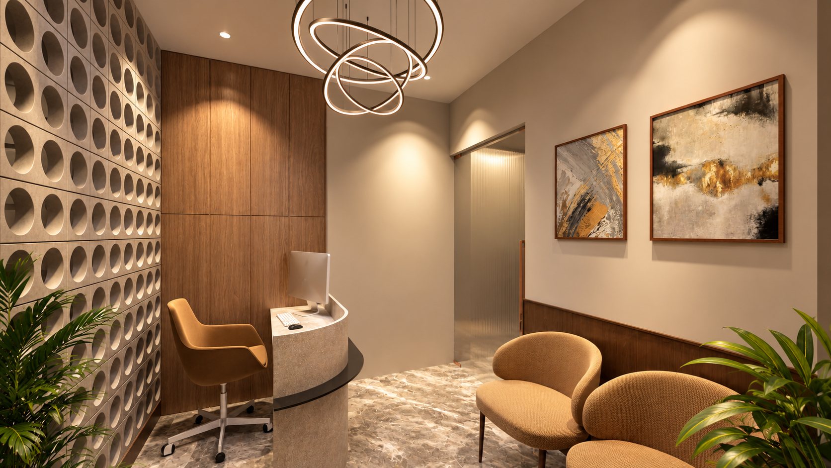
The office of a textile distributor — the room where mills, brands and buyers are invited to see what he carries. So the office had to do what a sales folder cannot: put the fabric itself on the walls.
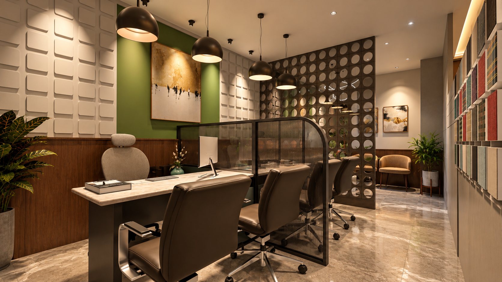
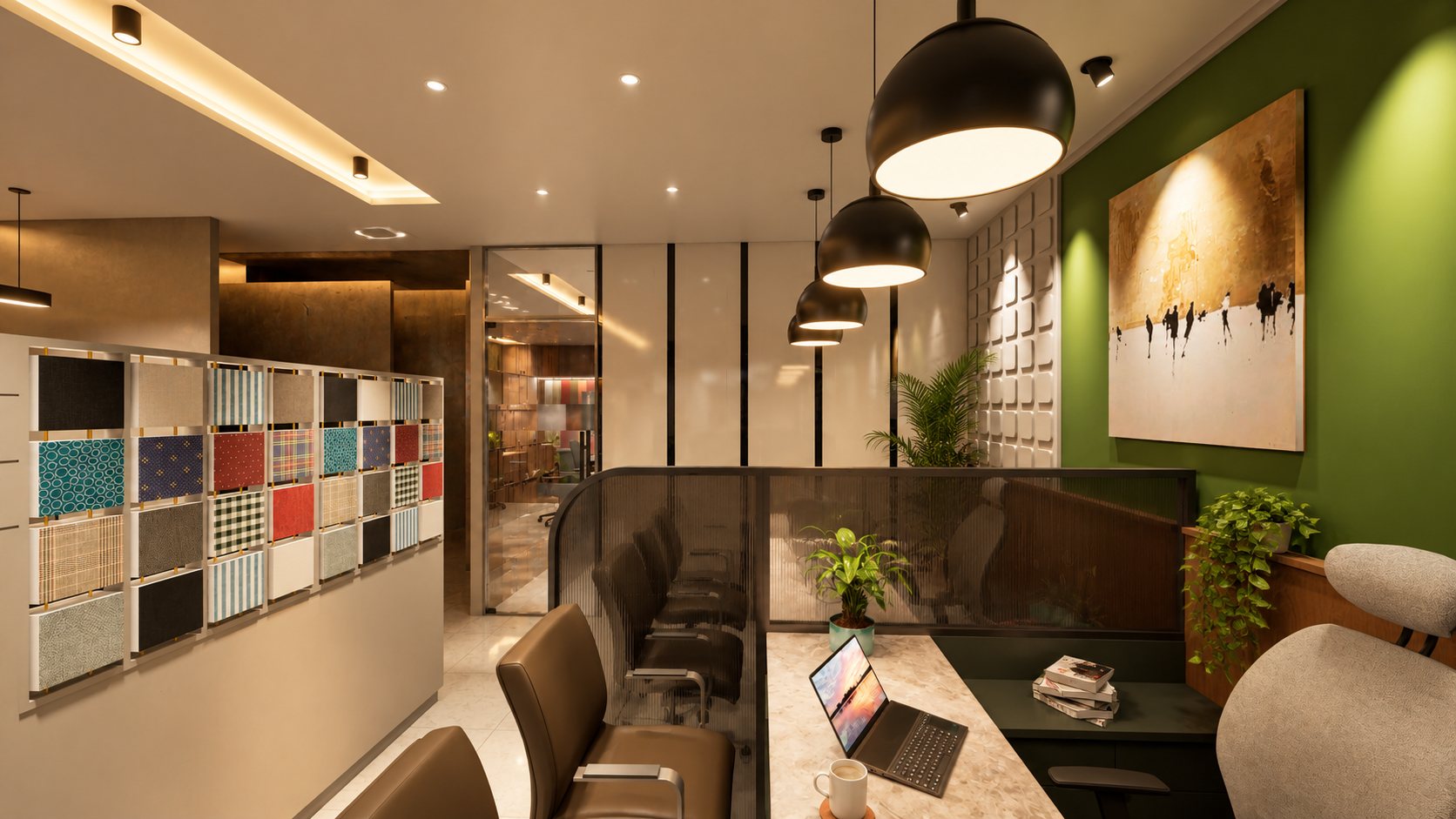
We used textile in two ways. In the workspaces, full-height fabric panels in graded colour run along the wall like a live shade card. In the client area, small square fabric panels become a partition you can read, touch and change. The rest of the palette — walnut, stone, soft grey and a deep green — stays quiet so the fabric leads.
In the client cabins, a frame of small, square fabric panels divides the space instead of a plain wall. It separates without closing off, shows a collection at eye level, and each square can be lifted out and replaced when the range changes — so the partition is never out of season.
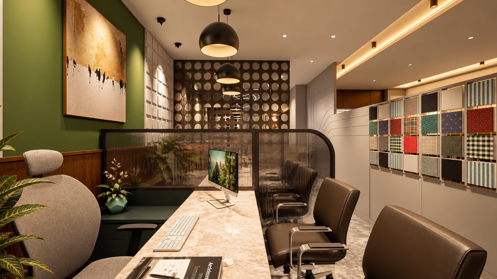
A stone-topped desk, a curved fluted-glass screen for privacy, a deep green wall, and opposite the visitor, the swatch partition. Every meeting happens in front of the product.
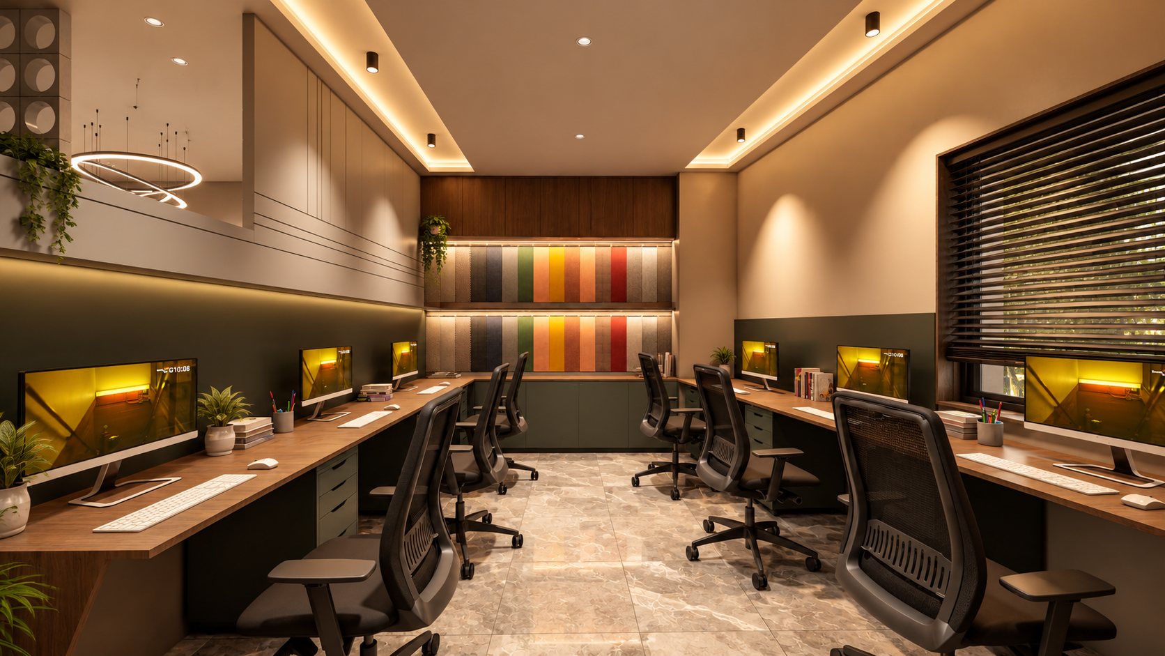
Along the end wall of the workspaces, fabric panels run in graded colour — greys and greens into ochre, orange and red — lit from above like a display shelf. It softens the room acoustically and turns the team’s back wall into the company’s range.
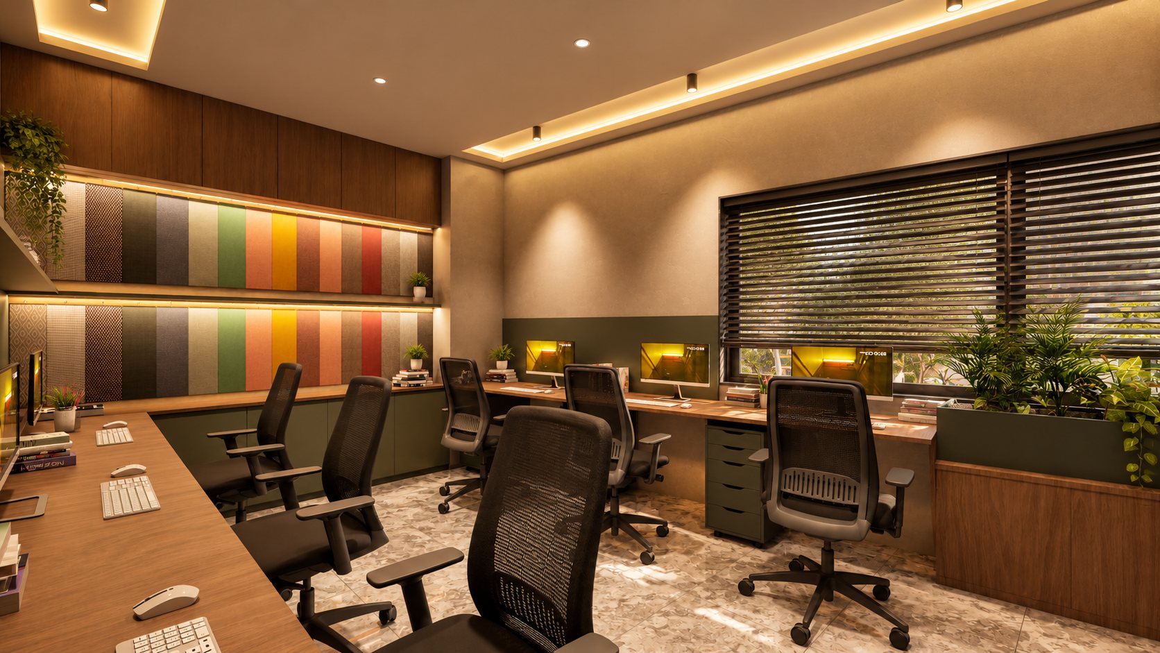
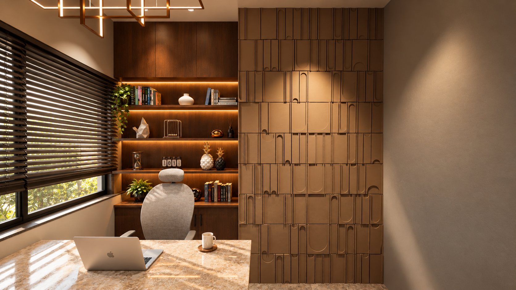
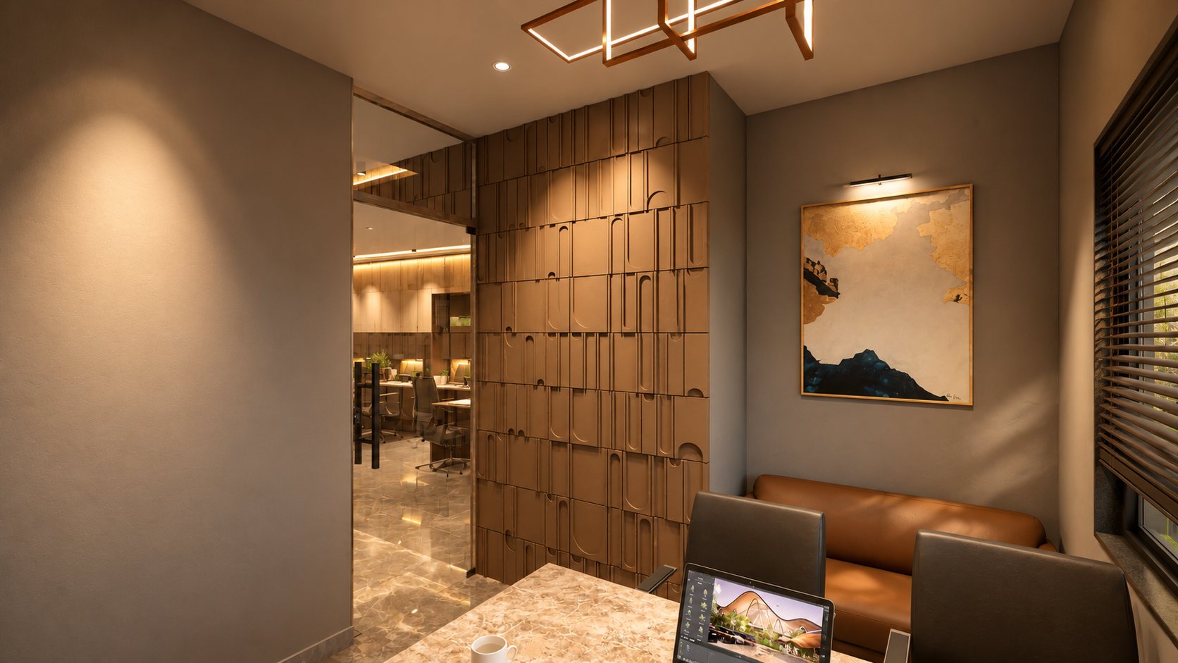
The director’s cabin carries the idea into relief tile: a wall of stacked, carved panels beside lit walnut shelving, a stone desk at the window, and a leather sofa for the longer conversations.
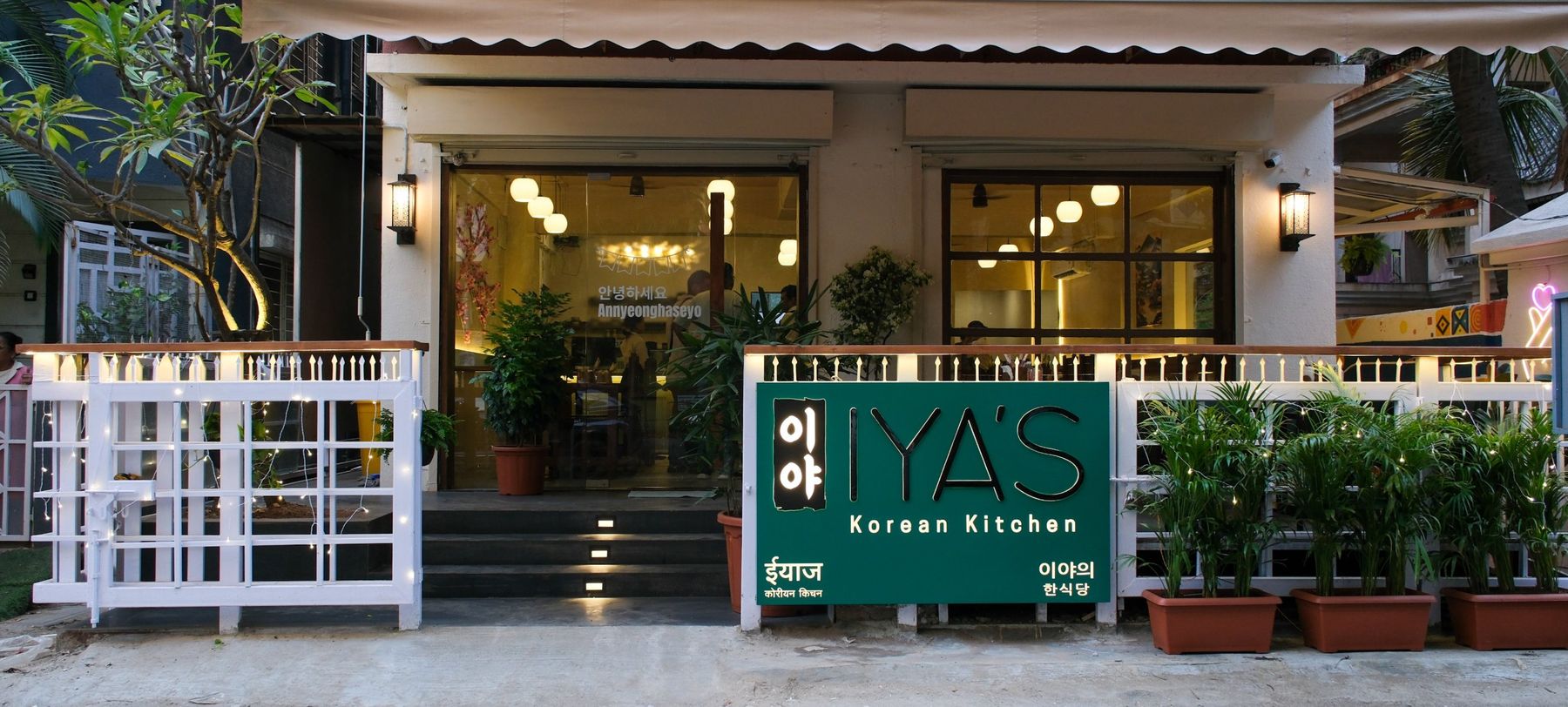
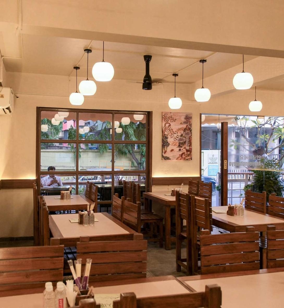
The space came to us as an existing restaurant, with a tight budget and a tighter timeline. The brief was not to start again — it was to make what was already there feel new.
Rebuilding from scratch would have spent money and weeks the client did not have. So we kept what worked: the chairs, the patterned floor, and every window and door opening, exactly where they were. What changed is everything a guest notices — the materials, the light, and the way the room feels at dinner.
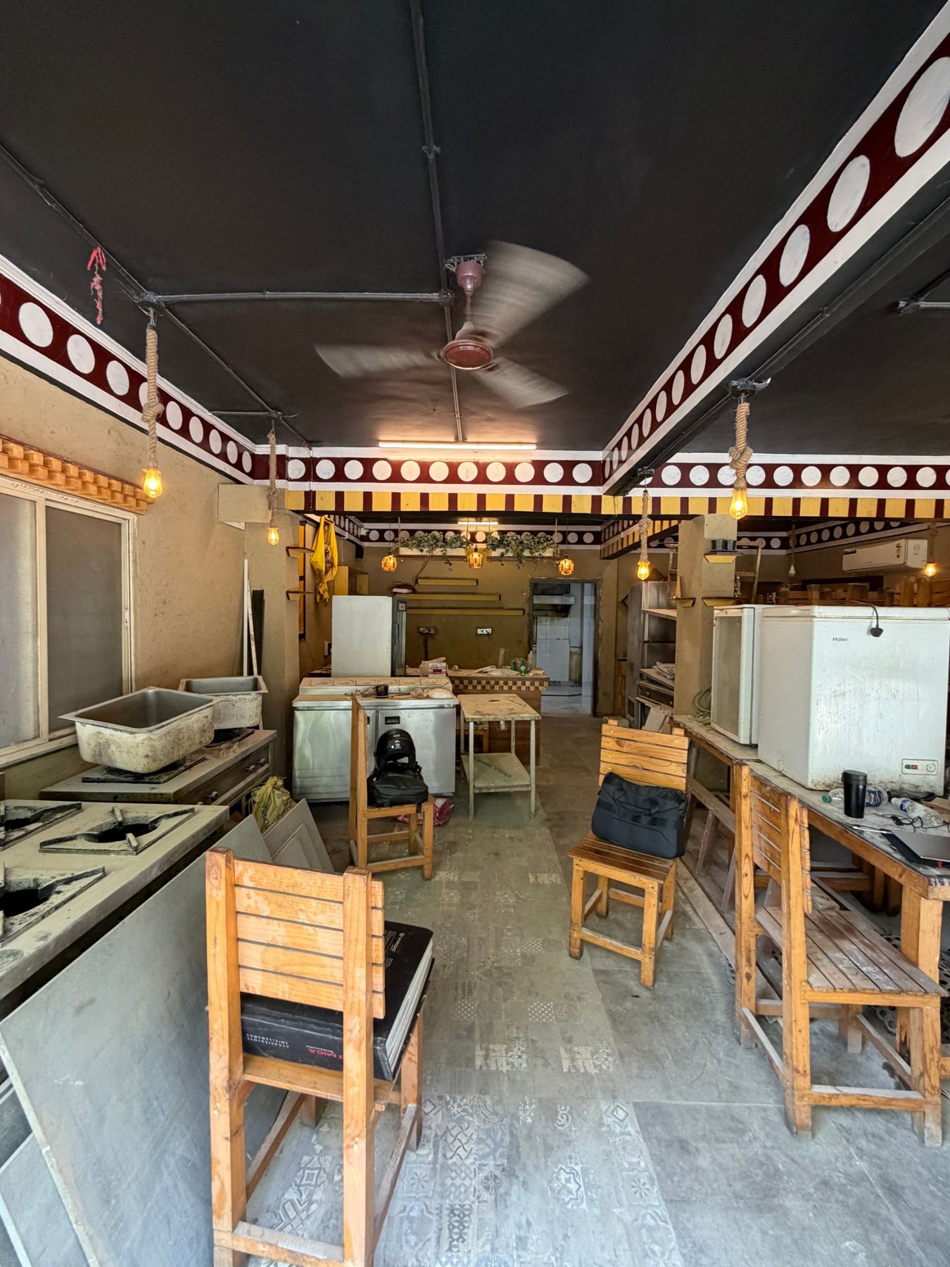 Before
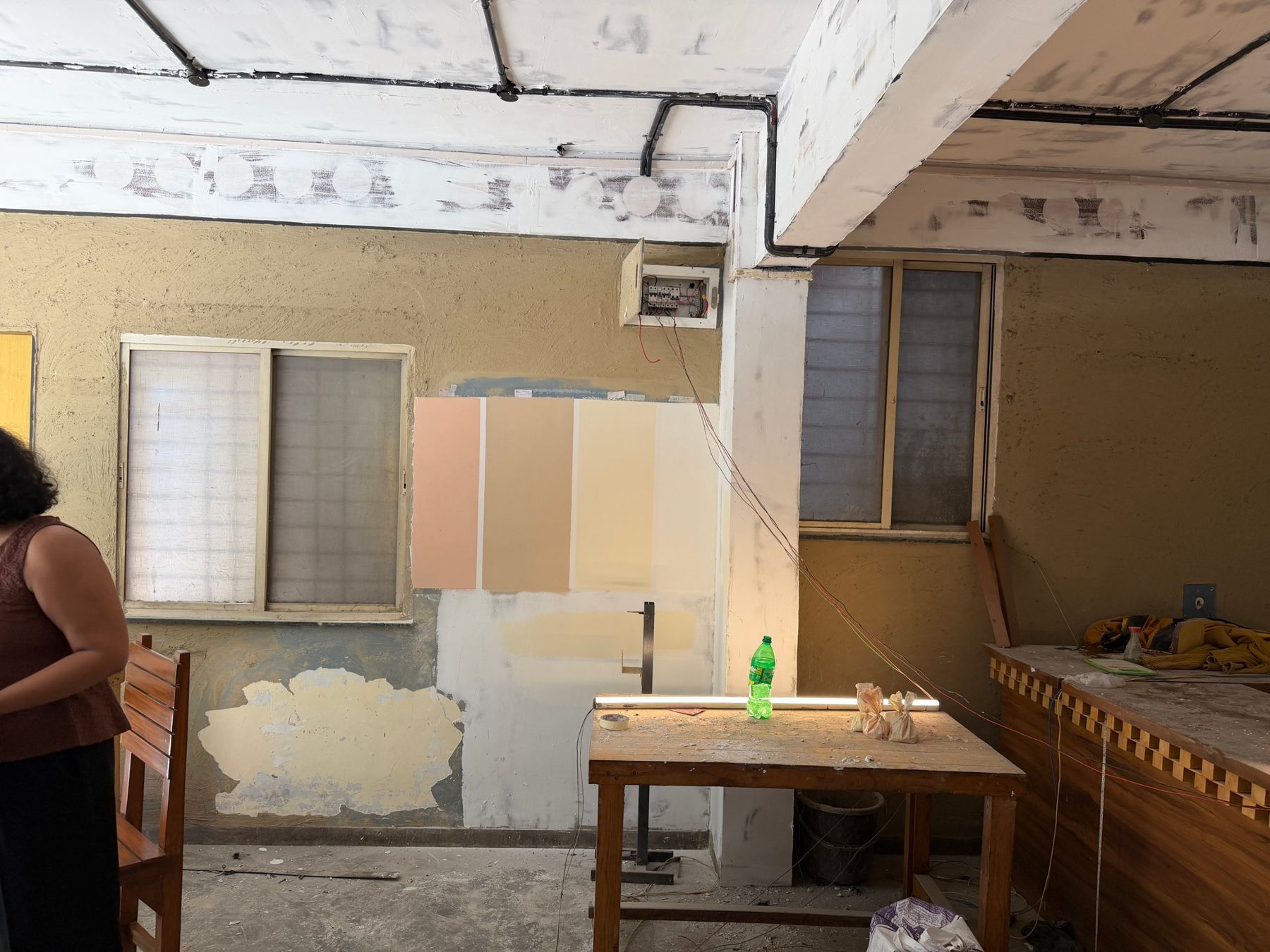 During
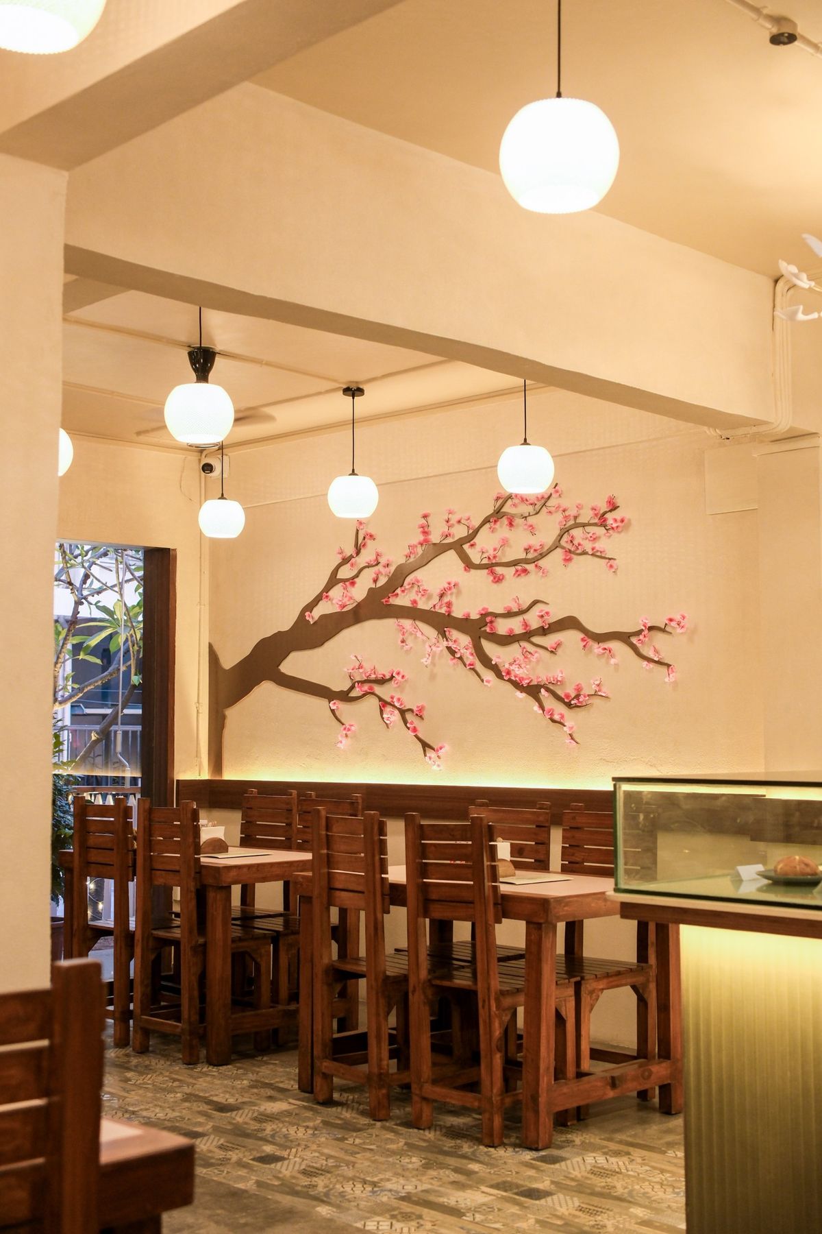 After
In from the street, into the dining room, past the kitchen, and out along an open-air passage to the washroom. The layout stayed; we worked within its walls and openings, and put the budget where guests would feel it — in the light and on the tables.
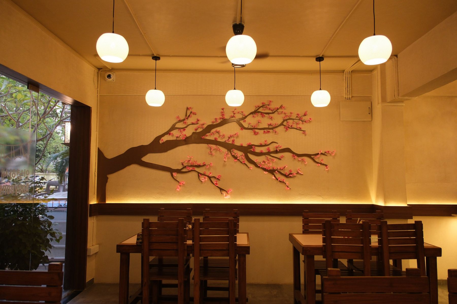
A false ceiling would have cost time and covered the room's height. Instead we kept the ceiling open and hung pendants designed and 3D-printed at our Alygn Labs facility, made for this room. The ceiling now reads as part of the space — warm, lit and honest.
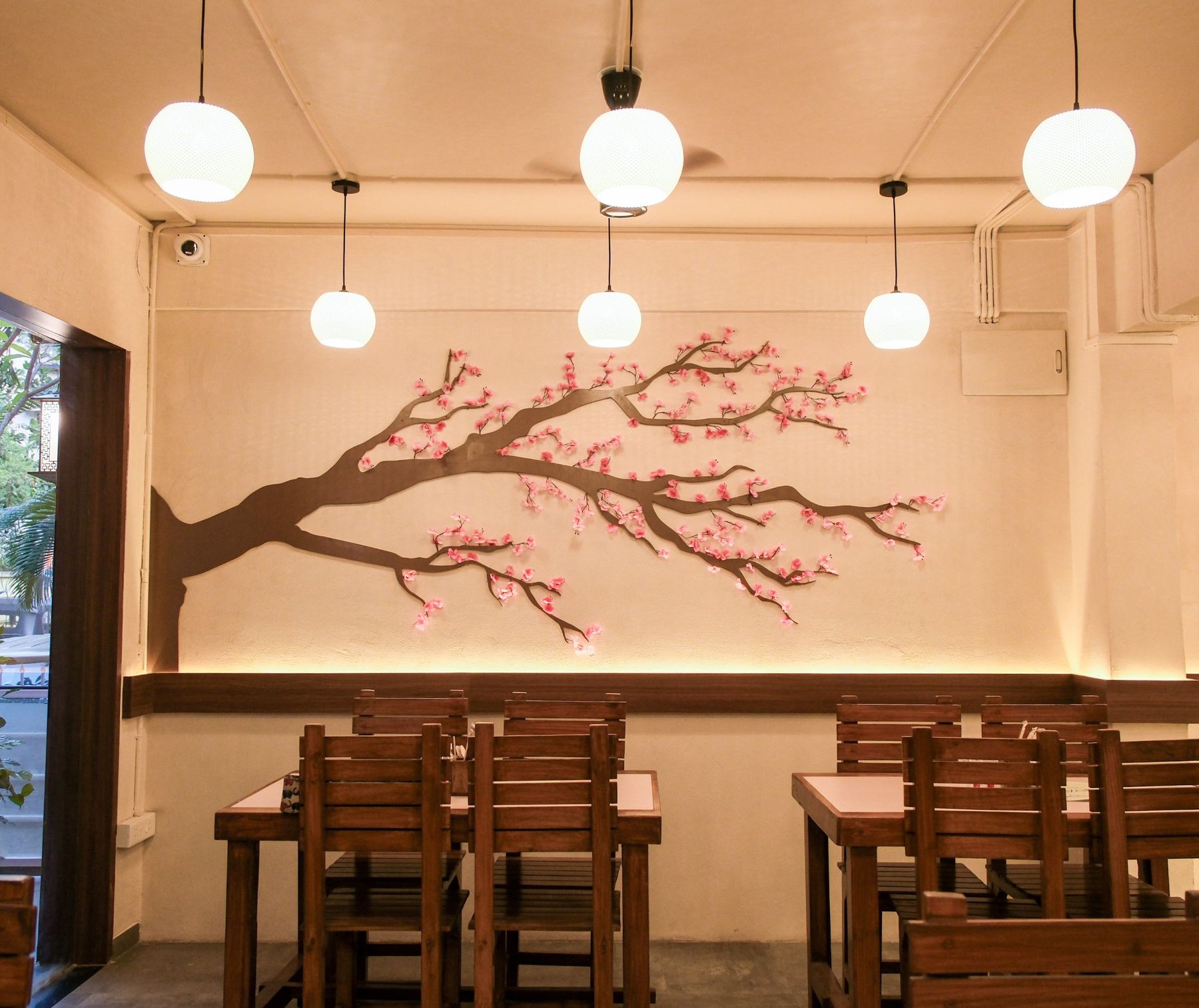
The feature wall carries a cherry blossom tree made from multiple layers of ply, shaped and assembled on site, then polished. It is joinery, not a print — the kind of detail that only happens when the people designing it are the people building it.
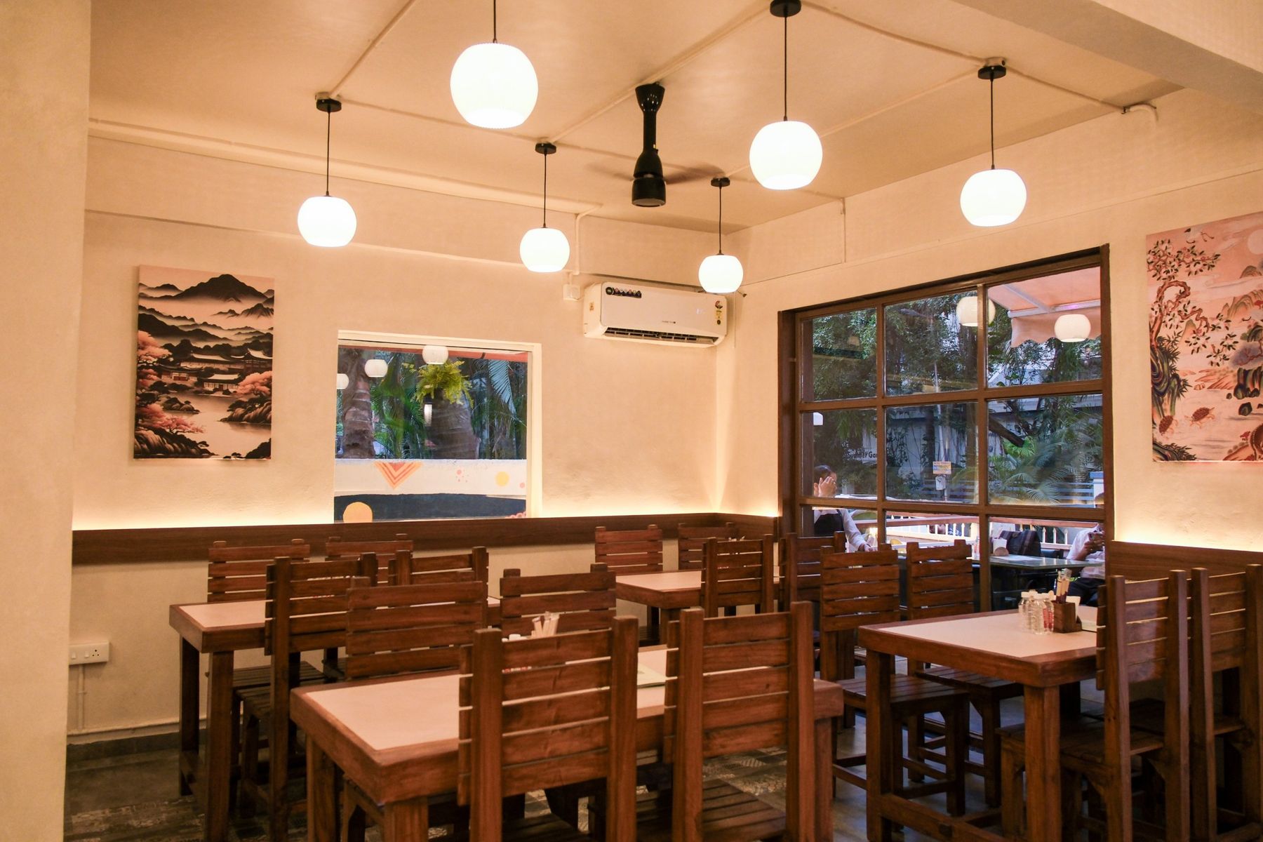
The existing tables stayed in service. We customised them with pink tile tops, carrying the restaurant’s own design language onto the surfaces every guest touches — a new finish without a new purchase.
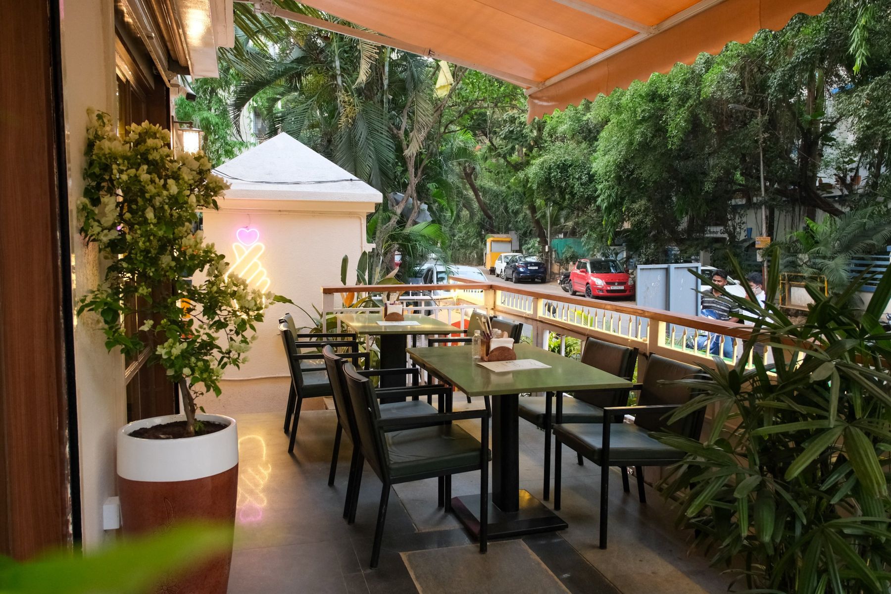
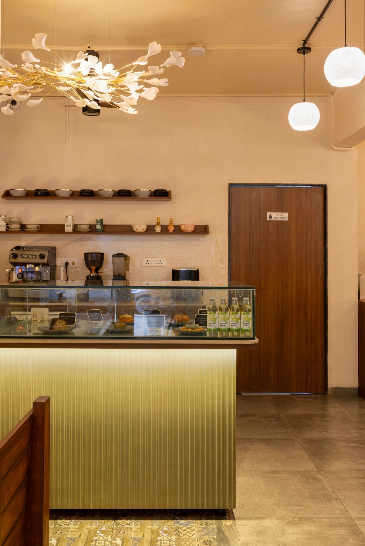
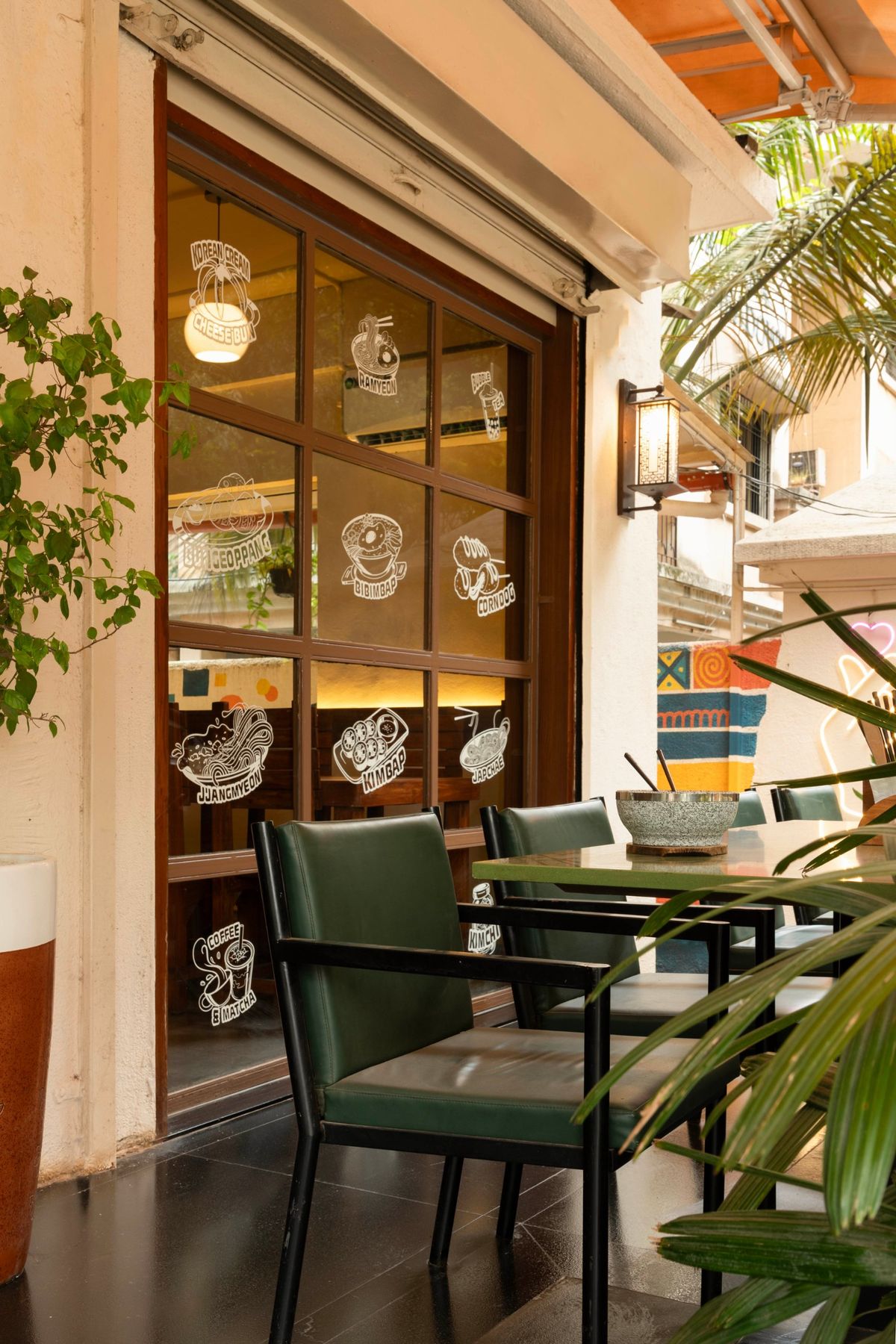
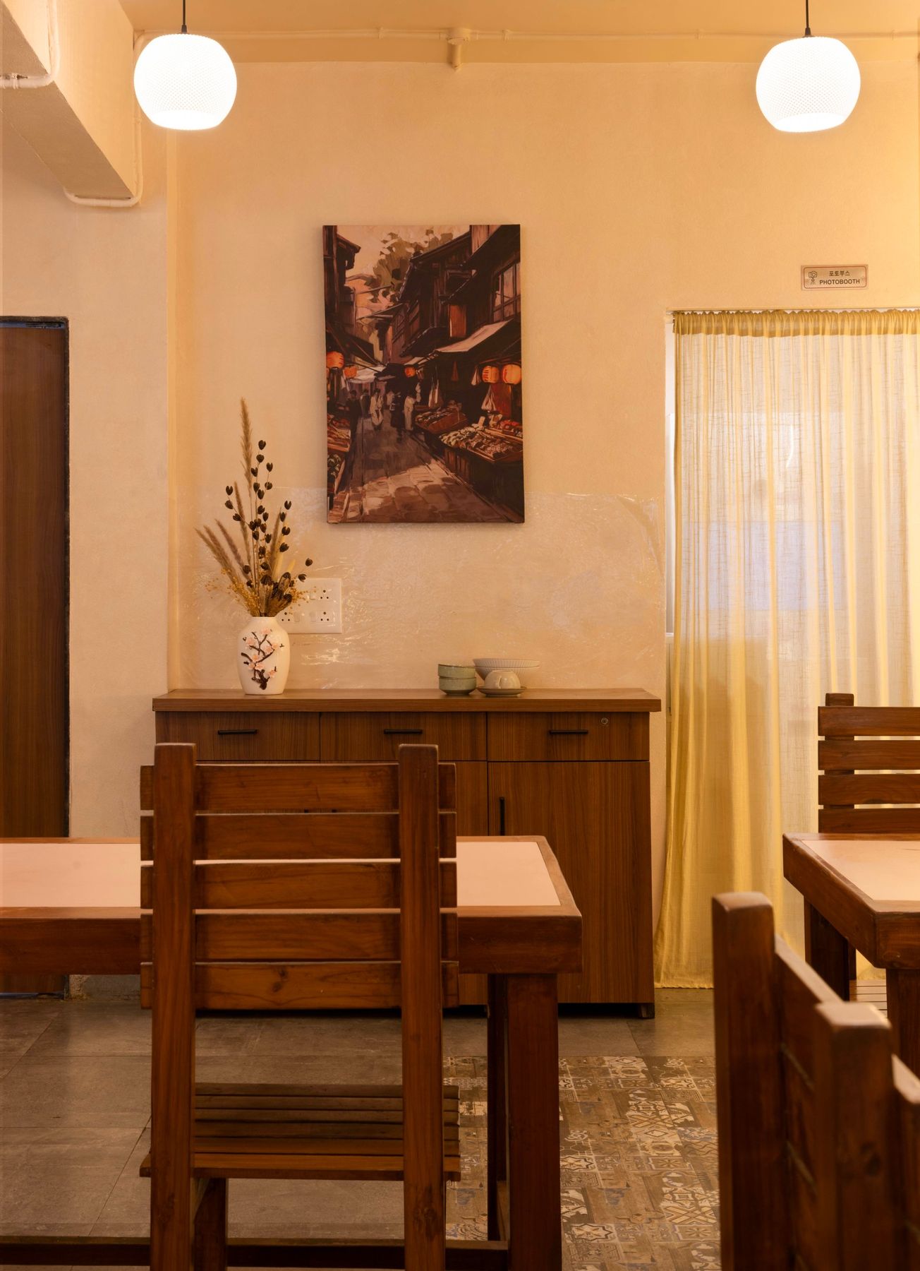
Refurbishment is its own brief: know what to keep, and spend where guests will feel it.
Alygn Spaces is led by its two founding partners, both practising architects. Both are personally involved in every project — there is no account layer between the client and the people doing the work.
Trained at Hafeez Contractor, then spent five years on site delivering government projects — an education in the distance between what is drawn and what actually gets built. Founded Alygn Spaces in 2026 to close that distance, pairing design authorship with execution knowledge to build world-class spaces one project at a time.
Began his practice at Prashant Deshmukh Architects, then served as lead architect for G. M. Kenjale, running projects through to 2025 for the group’s development arm, Michelangelo. Co-founded Alygn Spaces to pursue the same conviction — that spaces are best realised by the people who designed them.
A partner is accountable for every project from first meeting to final snag.
The firm is run by designers who build, not by contractors who have hired designers.
A young practice built on delivery experience that considerably predates it.
Tell us about the site. A partner replies — there is no account layer between you and the people doing the work.